Category

Stock

Category

A project that I have been working on in recent years is Horizontal PnF Counting using Percent Scaling. The method has generated promising results. Here we look at two case studies that illustrate the techniques value. Using the ‘Percentage Chart Scaling’ Method in StockCharts.com Point & Figure charting platform produces a Log Scale PnF chart. The percent scale defaults to 1% but can be adjusted manually. The case study charts in this blog are 3% scale PnF Charts. It takes a 3% change in price to move to the next vertical grid column.

This method is useful for estimating the price objective potential of a dynamically growing financial instrument. The traditional rules for counting horizontal (range-bound) structures also applies to the log-scale method.

The first case study is the bull market run in the S&P 500 Index from 2010 to the Bull Market peak in 2021. Each of the Re-Accumulation pauses are counted and flagged for their price projection estimates. These Re-Accumulations can take a year or more to unfold and build a Cause for the next upward ascent. The counts are remarkably accurate and useful. Please take time to study each of them.

This charting method has been made possible by the introduction of computerization. This technique is a compounding function rather than a simple horizontal counting method used in traditional fixed scale PnF charting methodology. Therefore, each horizontal column in the range-bound structure represents a compounding event. An example of a 10 column wide range-bound price structure represents 10 periods of say 3% growth in the subsequent upward trend. Thus 10 periods of growth at 3% results in a compounded appreciation of 33.1% which would be the price target for the advance.

The benefit of this PnF method is the capability of estimating the compounded growth of a dynamically advancing investment. As is the case with traditional PnF Method the time duration of the move remains an unknown. It is best to employ log-scale for dramatically rising and volatile instruments. For smaller ‘Swing Trading’ structures arithmetic scaling is most effective. Fellow Wyckoffian Alessio Rutigliano has used log scaling PnF very effectively in the analysis of the Crypto Markets. Alessio’s analytical work on Crypto Markets can be seen and studied at WyckoffAnalytics.com.

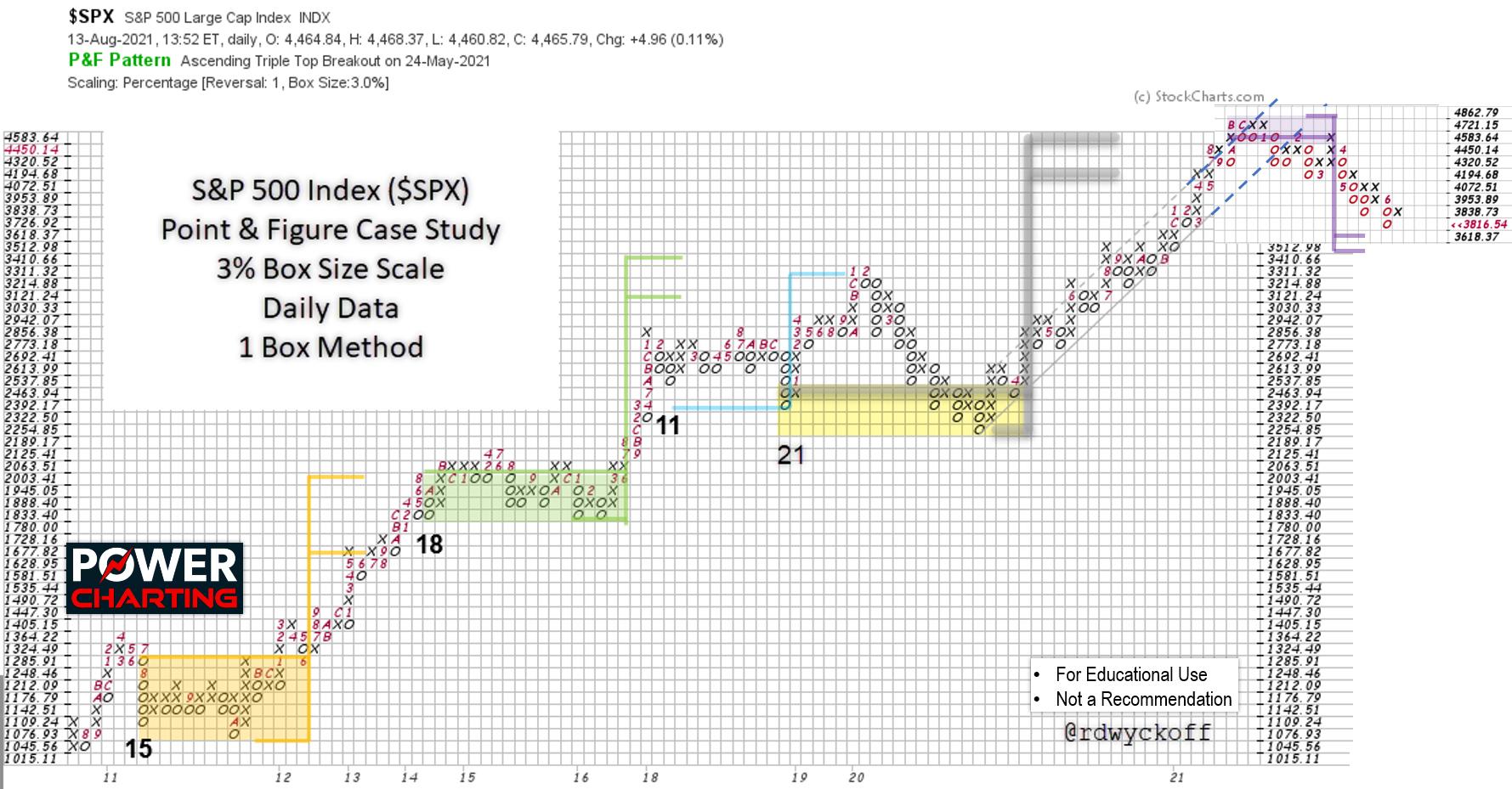
S&P 500 Index ($SPX) Point & Figure Case Study. 3% Scaling, 1-Box Reversal Method.

This log-scale horizontal PnF study of the S&P 500 Index spans more than a decade. The bull run from 2010 to 2021 had four well defined ‘Re-Accumulation’ periods. Each of these structures identified price targets that were eventually achieved. The final upward leg of the Bull Market was dramatic in its persistency and was preceded by a long and volatile trading range. The horizontal PnF count was exceeded by only one box and was the conclusion of the bull market. The log scale of this chart study was in 3% increments, which is very aggressive scaling, and illustrates what a virile bull market this decade long period was. Consider that each upward chart entry (entered as an ‘X’ on the chart) was a 3% increase.

The final upward surge into the Bull Market peak was capped by an acceleration of the index into a Buying Climax. A throwover of the trend channel combined with a fulfillment of the PnF count objective sealed the fate of this aging, historic Bull Market run.

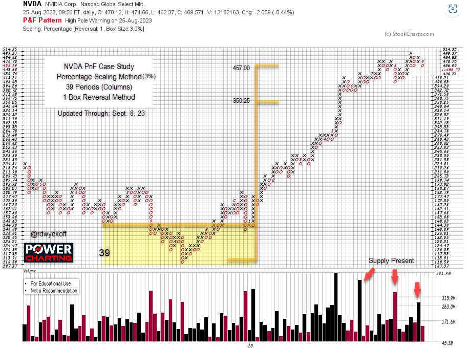
NVIDIA Corp. (NVDA) Point & Figure Case Study. 3% Scaling, 1-Box Reversal Method.

NVIDIA Corp. (NVDA) has become one of the “Magnificent 7′. The rally in 2022 and ’23 was preceded by a period of Accumulation. Across the Accumulation 39 columns were counted. One-Box reversal method is used. Thus 39 periods of 3% appreciation are estimated. From the low of the count area and from the count line two price objectives are generated and flagged. The price objectives are 350.25 to 457.00. Recently NVDA surged past the higher target zone. In a final upward run (usually considered climactic) the upper objective can be exceeded. If, in short order, the stock price reverses and falls below the higher objective back into the target zone we will consider the PnF count to be active and still valid. NVDA has shortening upward thrusts in the area of the $457.00 price objective. As of Friday, September 8th NVDA was back below the upper price objective, closing the week at $455.72. Sudden weakness to a support area would be further evidence that, at best, a new range-bound price structure is beginning. Which could become a fresh new Re-Accumulation or Distribution. Only time will tell, and we will watch closely.

Notes on Log Scale PnF Method

1.      Initially default to 1% Scaling. Then try 2% Scaling.

2.      Count Accumulation and Re-Accumulation structures as you would with arithmetic scale charts.

3.      Default to 1-box reversal charts. Avoid counting 3-box charts.

4.      Primarily use log-scale method for dynamically growing financial assets. Use arithmetic scale otherwise.

5.      Count very conservatively. Big counts will generate very big price objectives using log-scale.

6.      Use a financial calculator or Excel to calculate compounded growth for the price objectives.

7.      For Distribution and Re-Distribution default to arithmetic scale PnF charts to estimate price targets. Log scale will typically result in over-counting of downside objectives.

8.      Lots of practice will help you discern when arithmetic scale or log-scale is the best method.


All the Best,

Bruce

@rdwyckoff

Disclaimer: This blog is for educational purposes only and should not be construed as financial advice. The ideas and strategies should never be used without first assessing your own personal and financial situation, or without consulting a financial professional. 


Announcement:

TSAA-SF Annual Conference

In-person in San Francisco. Livestreaming for dues paying members.


The TSAA-SF will be hosting our 2023 annual conference, in partnership with AAPTA, at Golden Gate University on Sep 16, 2023. 


Speakers include

Linda Raschke – Auction Theory versus the Theory of Reflexivity

Brett Villaume – Understanding Relative Strength

Bruce Fraser – Swing Trading Technique Using the Wyckoff Method

Ali Merchant – Power of trend lines and market outlook using major indices

Bob Schott – Technical Analysis for the Buy Side

Eoin Treacy – Waiting for Godot

Damon Pavlatos – Anticipating Market Action using Market Profile, Volume Analytics Strategies along with traditional charting analysis.


Cost: TSAA-SF members in-person: $150 (breakfast and lunch included), non-members: $400. Free livestreaming for TSAA-SF members. Join the TSAA-SF now for only $75/year.


For more information on the speakers and their topics and to register (Click Here):

https://www.tsaasf.org/event-5391152


 Power Charting TV:


Wyckoff Case Study: A Period of Distribution Featuring Nvidia! First of Three Parts. Special Guest: Roman Bogomazov

Description:

Master Wyckoffian Roman Bogomazov joins Bruce Fraser for an in-depth historical chart case study of Nvidia common stock. This is the first installment of a three-part Power Charting series devoted to analyzing Nvidia common stock. Each of the three episodes is evaluated using the Wyckoff Chart Reading Method in chronological order. This episode evaluates a period of Distribution. In conducting these case studies, the objective is to illustrate and develop in the viewer an appreciation of the nuance the Wyckoff Method offers in the understanding of the present position and likely future direction of a stock or index, using chart analysis, for the intention of more effectively campaigning that instrument at the best possible time.
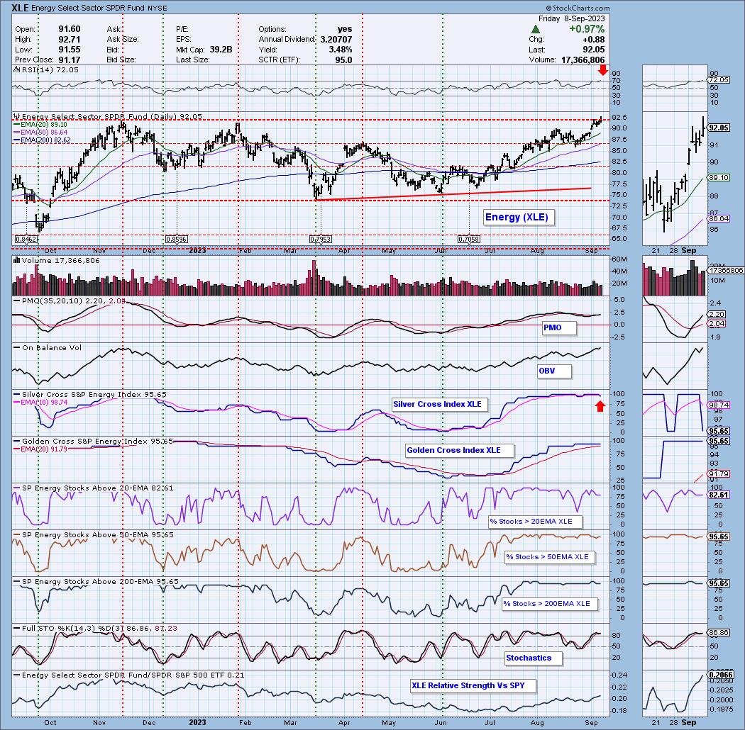

In the previous technical note, the importance of the support level of 19250 was discussed; it was mentioned that if this level stands protected for Nifty, the Index can rebound and inch higher towards 19700+ levels. While trading along these lines, the markets enjoyed trending sessions throughout the week. It had a technical surge and widened its trading range as well. Against the range of 234.90 points seen in the week before this one, NIFTY moved in a larger 434.30 points range and also managed to close near its high point of the range. While continuing to trend all through the past five sessions, the headline index NIFTY closed with a net gain of 384.65 points (+1.98%) on a weekly basis. It may be noted that September has seen the index trading higher by 566.15 points as of now.

The markets are once again within a kissing distance of their all-time high of 19991; the only concerning factor that remains is the volatility. INDIAVIX is once again near its multi-month lows. However, the undercurrent in the markets remains strong. While PSU Banks were relatively outperforming the broader markets, we may also see Private Banks and Financial Services space playing catchup. However, the levels of 19990 remain a strong resistance area. Going by the present technical setup, Nifty has created a trading range between 19500-19990 for itself; this time, any surge beyond this point will result in a meaningful rally.

The coming week will see the levels of 19900 and 20200 acting as potential resistance points going by the options data. The support comes in at 19620 and 19500 levels.

The weekly MACD is in continuing buy mode; it is bullish and trades above the signal line. The widening of the Histogram this time shows an acceleration of momentum on the upside. The weekly RSI is 69.31; it remains neutral and does not show any divergence against the price. A large white candle that emerged shows the strength in the direction of the trend.

The pattern analysis shows an encouraging picture, especially after this week’s move. The pattern analysis of the weekly charts shows that NIFTY achieved a major breakout when it crossed above the previous high that existed near 18900 levels. Following this breakout, the index surged close to 1,000 points following which it suffered a retracement. It gave up over 75% of its breakout journey and was about to suffer a full throwback. However, it has bounced higher forming a higher bottom near 19250. Therefore, so long as 19250 stands protected in the near term, the primary uptrend will stay intact. Only a violation of the 19000-19250 zone will push the markets in an intermediate trend.

All in all, the markets are expected to largely trade with a positive bias; some consolidation though cannot be ruled out. The low point of the previous week, i.e., 19432, rounded off to 19400 should stay protected. We may also see some good sector rotation taking place. We will continue to see PSE, IT, Auto, Consumption, and the banking space making highly stock-specific moves. It is strongly recommended to continue to remain stock-specific in approach and also keep protecting profits at each higher level as VIX continues to remain a concern. Short may be avoided but protection of profits at higher levels is strongly advised over the coming week.


Sector Analysis for the coming week

In our look at Relative Rotation Graphs®, we compared various sectors against CNX500 (NIFTY 500 Index), which represents over 95% of the free float market cap of all the stocks listed.

Relative Rotation Graphs (RRG) analysis does not show any major change in the sectoral setup. Nifty Media, Metal, PSU Bank, Pharma, PSE, Energy, and Midcap 100 Indices are inside the leading quadrant. The Nifty Pharma Index is seen giving up on its relative momentum but overall, these groups are set to outperform the broader NIFTY 500 Index on relative terms.

Nifty Auto and Nifty Realty are inside the weakening quadrant. The infrastructure index is also inside the weakening quadrant but it is seen on the verge of crossing over again inside the leading quadrant.

The Nifty Consumption Index has rolled inside the lagging quadrant. Nifty Bank, Services Sector, Financial Services, and FMCG Indices are also inside the lagging quadrant. These groups are set to relatively underperform the broader markets.

Nifty Commodities and IT indices are inside the improving quadrant and are seen maintaining their relative momentum against the broader markets.

Important Note: RRG™ charts show the relative strength and momentum of a group of stocks. In the above Chart, they show relative performance against NIFTY500 Index (Broader Markets) and should not be used directly as buy or sell signals.  


Milan Vaishnav, CMT, MSTA

Consulting Technical Analyst

www.EquityResearch.asia | www.ChartWizard.ae

On this week’s edition of StockCharts TV‘s StockCharts in Focus, Grayson shares one of the simplest yet most effective ways to streamline and enhance your charting routines on the SharpCharts workbench: StyleButtons. By assigning your favorite “ChartStyles” (chart templates that include all of the indicators, overlays and other settings for your charts) to StyleButtons, you can quickly and easily access your go-to charts in a single click. You’ll learn how to create ChartStyles, assign them to StyleButtons and organize their order. Plus, Grayson shares some of the ways he personally organizes his own ChartStyles and StyleButtons and demonstrate how he uses them in his own approach to charting the markets.

This video originally premiered on September 8, 2023. Click on the above image to watch on our dedicated StockCharts in Focus page on StockCharts TV, or click this link to watch on YouTube.

You can view all previously recorded episodes of StockCharts in Focus at this link.


In this episode of StockCharts TV‘s The MEM Edge, Mary Ellen McGonagle reviews the weakness in the broader markets while highlighting bright spots amid base breakouts. She also shares best ways to prepare your watch list and why the Dow Industrial Index outperformed.

This video originally premiered September 8, 2023. Click on the above image to watch on our dedicated MEM Edge page on StockCharts TV, or click this link to watch on YouTube.

New episodes of The MEM Edge premiere weekly on Fridays. You can view all previously recorded episodes at this link. You can also receive a 4-week free trial of her MEM Edge Report by clicking the image below.

We are now in the seasonally weakest part of the calendar year. The summer doldrums often lead to a meaningful pullback in the third quarter, and 2023 has, so far, not disappointed by following the seasonal tendencies quite well.

The month of August saw leading names like Apple (AAPL) and Microsoft (MSFT) pull back from new highs, causing many investors to rethink the “2023 is going to go up all year” thesis. So now that we’ve experienced an initial drop, what’s next for the S&P 500?

Today we’ll revisit the concept of “probabilistic analysis”, where we lay out four different potential scenarios for the S&P 500. There are three things I hope you take away from this exercise.

  1. It’s important to have a thesis as to what you think will come next for stocks. This should be based on a meaningful combination of four key pillars: fundamental, technical, macroeconomic, and behavioral. And your portfolio should be positioned to reflect what you see as the most likely outcome.
  2. It’s also important to consider alternative scenarios. What if the market is way more bullish than you’d expect? What if some five-standard-deviation event pops up, and stocks suddenly drop 20 percent? The best way to break out of your predetermined biases is to actively consider alternative points of view.
  3. It’s incredibly important to think about how you would adapt to one of those alternate scenarios. How would your portfolio perform in a risk-off environment in the coming months? Are you prepared for a sudden spike in risk assets, and at what point would you need to change your positions to match this new reality?

I have found that the most successful investors don’t know all the answers, but they ask the best questions. So let’s broaden our horizons a bit, and consider four potential future paths for the S&P 500 over the next six to eight weeks. But first, we’ll review the recent pullback for the major equity averages.

A brief seasonality check on the S&P 500 will show that August and September tend to be quite weak for the main US equity benchmark. So the drop we saw in early August actually follows the seasonal playbook quite well, as would further weakness in September.

We’ve been thinking about the possibility of a much deeper correction for risk assets, and it’s a distinct possibility that we’re now in an A-B-C pullback, which would take us to a new swing low right around options expiration in the third week of September. But at the same time that charts like LVS are displaying classic topping patterns, we can’t help but notice that stocks like Alphabet (GOOGL) appear to be firmly entrenched in a protracted bullish phase.

An uptrend is defined by a persistent pattern of higher highs and higher lows, and GOOGL certainly seems to be displaying that classic bullish phase quite well. How bearish do you want to be when Alphabet is just pounding higher month after month?

With our benchmarks pulling back and breadth conditions deteriorating, as well as key growth stocks like GOOGL still holding above support, let’s lay out four potential scenarios for the S&P 500 over the next six-to-eight weeks. And remember the point of this exercise is threefold:

  1. Consider all four potential future paths for the index, think about what would cause each scenario to unfold in terms of the macro drivers, and review what signals/patterns/indicators would confirm the scenario.
  2. Decide which scenario you feel is most likely, and why you think that’s the case. Don’t forget to drop me a comment and let me know your vote!
  3. Think about each of the four scenarios would impact your current portfolio. How would you manage risk in each case? How and when would you take action to adapt to this new reality?

Let’s start with the most optimistic scenario, involving a strong summer push for stocks.

Scenario #1: The Very Bullish Scenario

What if the pullback of the next five weeks is over, and the market goes right back to a full risk-on mode? Stocks like AAPL and MSFT would most likely return back to test new highs and interest rates would probably come down enough, as economic data continues to show at the Fed’s efforts have successfully slowed down the economy.

This Very Bullish Scenario would mean a break above 4600, and when we revisit the chart in late September, we’re talking about the possibility of new all-time highs for the S&P 500 and Nasdaq in October.

Scenario #2: The Mildly Bullish Scenario

Markets can correct in two ways: price and time. A price correction (see February 2023) involves the chart moving lower quickly as the market quickly sheds value. A time correction (see April-May 2023) means there’s not much of a price drop, and the “correction” is more of a pause of the uptrend.

There’s a possibility that the July high around 4600 still holds as resistance, and a time correction keeps the S&P 500 in the 4300-4600 range. Keep in mind that there are plenty of opportunities for sectors like Energy to thrive in a sideways market, but the major indexes don’t make any headway in either direction.

Scenario #3: The Mildly Bearish Scenario

What if the A-B-C correction outlined above plays out, and the S&P 500 index pushes lower to retest the 200-day moving average? If interest rates remain elevated, and growth stocks continue to pull back, this would be a very reasonable outcome for the equity markets.

One of my mentors used to say, “Nothing good happens below the 200-day moving average.” The good news is the Mildly Bearish Scenario means we drop further from current levels, but still manage to find support at this important long-term barometer.

Scenario #4: The Super Bearish Scenario

This is where things could get really nasty. What if the market goes full risk-off, interest rates push higher, economic data comes in hotter than expected, and the Fed is forced to consider further rate hikes instead of debating when to ease monetary conditions?

This Super Bearish Scenario would mean the S&P 500 breaks down through 4300 and 4200, leaving the 200-day moving average in the rearview mirror, and in late September we’re debating whether the S&P 500 and Nasdaq will make a new low before year-end 2023.

Have you decided which of these four potential scenarios is most likely based on your analysis? Head over to my YouTube channel and drop a comment with your vote and why you see that as the most likely outcome.

Also, we did a similar analysis back on the S&P 500 back in June. The “mildly bullish” scenario ending up matching the market action pretty closely. Which scenario did you vote for?

Only by expanding our thinking through probabilistic analysis can we be best prepared for whatever the future may hold!

RR#6,

Dave

P.S. Ready to upgrade your investment process? Check out my free behavioral investing course!


David Keller, CMT

Chief Market Strategist

StockCharts.com


Disclaimer: This blog is for educational purposes only and should not be construed as financial advice. The ideas and strategies should never be used without first assessing your own personal and financial situation, or without consulting a financial professional.

The author does not have a position in mentioned securities at the time of publication. Any opinions expressed herein are solely those of the author and do not in any way represent the views or opinions of any other person or entity.

The Energy sector (XLE) has been enjoying a rally throughout the summer. Today it logged a new all-time high on a small breakout. While the sector looks impervious, there are a few concerns that we should point out. First would be the overbought RSI. While a stock’s price can remain overbought, typically when the RSI reaches this level you will see at least a pause. The other issue is the “Bearish Shift” of the Silver Cross Index (SCI) as it crossed below its signal line. The rest of the indicators, including our primary Price Momentum Oscillator (PMO) are bullish. You’ll notice that participation (%Stocks > 20/50/200EMAs) remains well above our bullish 50% threshold and really isn’t bleeding off much. Stochastics are comfortably above 80 suggesting internal strength.

Conclusion: The Energy sector looks very strong, but we are noticing a few problems under the surface. We should remember that overbought conditions can persist in a bull market which XLE clearly is in. If the Silver Cross Index continues to lose ground, we would tighten stops on your Energy positions.

If you’d like to be notified when major indexes, sectors and select industry groups see “Bullish/Bearish Shifts” and given the bias in the intermediate and long terms? You’ll find it in every DP Alert report!

Good Luck & Good Trading,

Erin Swenlin


Learn more about DecisionPoint.com:


Watch the latest episode of DecisionPoint on StockCharts TV’s YouTube channel here!


Try us out for two weeks with a trial subscription!

Use coupon code: DPTRIAL2 at checkout!


Technical Analysis is a windsock, not a crystal ball. –Carl Swenlin

(c) Copyright 2023 DecisionPoint.com


Disclaimer: This blog is for educational purposes only and should not be construed as financial advice. The ideas and strategies should never be used without first assessing your own personal and financial situation, or without consulting a financial professional. Any opinions expressed herein are solely those of the author, and do not in any way represent the views or opinions of any other person or entity.

DecisionPoint is not a registered investment advisor. Investment and trading decisions are solely your responsibility. DecisionPoint newsletters, blogs or website materials should NOT be interpreted as a recommendation or solicitation to buy or sell any security or to take any specific action.


Helpful DecisionPoint Links:

DecisionPoint Alert Chart List

DecisionPoint Golden Cross/Silver Cross Index Chart List

DecisionPoint Sector Chart List

DecisionPoint Chart Gallery

Trend Models

Price Momentum Oscillator (PMO)

On Balance Volume

Swenlin Trading Oscillators (STO-B and STO-V)

ITBM and ITVM

SCTR Ranking

Bear Market Rules


In this edition of StockCharts TV‘s The Final Bar, Dave wraps the week with a focus on weakening breadth conditions, the Russell 2000 and underperformance of small caps, and strong energy stocks driven by stronger crude oil prices. He answers viewer questions on using ETFs instead of bonds or cash to generate income, the downside to following a momentum-based approach, and comparing the McClellan Oscillator to the Bullish Percent Index.

This video originally premiered on September 8, 2023. Watch on our dedicated Final Bar page on StockCharts TV, or click this link to watch on YouTube.

New episodes of The Final Bar premiere every weekday afternoon LIVE at 4pm ET. You can view all previously recorded episodes at this link.

“September is when leaves and stocks tend to fall; On Wall Street, it’s the worst month of all.”— Stock Trader’s Almanac.

Why is September considered to be the worst month for stock market performance? There’s no right answer, but the general belief is that, because most people’s summer vacation ends and it’s back to school for kids, investors are inclined to sell their positions to lock in some gains. September also marks the end of the third quarter, when mutual fund managers do their end-of-quarter restructuring.

In addition to these factors, we’ve seen shares of Apple, Inc. (ticker symbol: AAPL) fall sharply after China’s restrictions on iPhones. NVIDIA (ticker symbol: NVDA) has also seen its share price fall. Other mega-cap stocks, such as Tesla (TSLA), Microsoft (MSFT), and Meta Platforms (META), are also trading off their highs. The broader indexes have also pulled back from late July to early August.

So far, the market is acting as it should in September. If you look at the weekly chart of the S&P 500 (see below), the trend still looks up. The S&P 500 ($SPX) has continued to trade above its 21-week exponential moving average (EMA), which could act as a support level if the index continues pulling back.

CHART 1: WEEKLY CHART OF S&P 500 INDEX. The index is still trending higher, trading above its 21-week EMA.Chart source: StockCharts.com (click on chart for live version). For educational purposes.

If you look at the daily chart of the S&P 500 below, since September 1, the index has been trending lower. The 21-day EMA is acting as a resistance level, but there needs to be a few more bars lower than the EMA to say the S&P 500 is correcting. A couple of days earlier, it seemed like the EMA was a support level.

CHART 2: DAILY CHART OF S&P 500. The 21-day EMA is now acting as a resistance level. The next support level is the 100-day moving average.Chart source: StockCharts.com (click chart for live version). For educational purposes.

How the index reacts to the 21-day EMA can give an indication of whether the index is likely to fall further. If the index fails to trade above its 21-day EMA, the next support on the daily chart is the 100-day simple moving average.

Investors are still concerned about interest rates. The uptick in the ISM numbers and a drop in initial jobless claims suggest the economy is still strong. This suggests that the Fed could still raise interest rates this year. Most likely, the interest rate hike won’t occur in the September meeting—the CME FedWatch Tool shows a 93% probability that interest rates will be unchanged. The probability of keeping interest rates steady in the November meeting drops to 56%. The Consumer Price Index (CPI) and Producer Price Index (PPI) for August will be released next week; it will be interesting to see if interest rate hikes have weaved into the economy.

One factor that could play into the inflation picture is the price of crude oil, which continues to increase. Crude oil is trading at around $87 per barrel. The last time oil was trading at this level was in November 2022. Besides tighter supply conditions, the rise in the US dollar could have pushed oil prices higher. The big question is if the price of crude oil will hit $100. It could, but if it moves toward the $120–$130 range, that could create demand pressure. 

Final Thoughts

So, a few things to keep an eye on next week. Let’s see if September plays out like it typically does. And after September comes the month that’s known for its unpredictability.

End-of-Week Wrap-Up

US equity indexes up; volatility down

  • $SPX up 0.14% at 4457.58, $INDU up 0.22% at 34577.28; $COMPQ up 0.09% at 13761.53
  • $VIX down 3.47% at 13.90
  • Best performing sector for the week: Energy
  • Worst performing sector for the week: Industrials
  • Top 5 Large Cap SCTR stocks: Super Micro Computer (SMCI); Celsius Holdings (CELH); Dell Technologies (DELL); Eli Lilly (LLY); XP Inc. (XP)

On the Radar Next Week

  • August CPI
  • August retail sales
  • PPI
  • September Michigan Consumer Sentiment (Prel)


Disclaimer: This blog is for educational purposes only and should not be construed as financial advice. The ideas and strategies should never be used without first assessing your own personal and financial situation, or without consulting a financial professional.

Probably the worst or at least one of the worst performers in the overall market and in the commodities market, natural gas is choppy and lifeless. So why write about it?

For starters, we love an underdog. Perhaps a bit too contrarian, as the reasons for the decline in natural gas may reverse quickly.

First off, much of the decline and lack of rally power is credited to cooler U.S forecasts. Secondly, a decline in US electricity output has weakened prices. Thirdly, the rig counts and EIA reports have been mixed.

On the flip side, Australia LNG workers are striking. Enbridge bid $14 billion for Dominion Utilities as the CEO described the assets the company is acquiring as “must-have” infrastructure for providing safe, reliable, and affordable energy. We like to consider all the fundamentals as part and parcel of the technicals.

In other words, regardless of where natural gas goes in the next few weeks, the risk/reward looks tempting, provided there is a sound risk point. No stubborn trading.

Compared to oil prices, natural gas looks cheap. Perhaps for good reasons, but, nonetheless, let’s examine the charts.

The first chart is of the ETF UNG. The top holding is the U.S. Dollar at 61.14%, which means that the ETF is heavy into cash. This is similar to what we saw in MSOS, the Cannabis ETF, back on June 21st when we wrote an article called “Is Cannabis Finally Low Enough to Go High?”

On dollar holdings, our research found if an ETF allocates a significant portion of its assets to holdings denominated in US dollars, it could be a defensive position during uncertain market conditions. Cash holdings can act as a buffer against market volatility or as a safe haven asset. Since MSOS is up over 30% since that article, we wonder, could UNG and its dollar holdings lessen over time?

The UNG chart leads us to make a few assumptions.

  1. There must be a high short float.
  2. The price is hanging onto the July 6-month calendar range low (red horizontal lone).
  3. Our Real Motion indicator shows a BULLISH divergence, with the momentum above the 50 daily moving average (blue) and in a bullish phase.
  4. Our Leadership indicator shows UNG underperforming, but, this past week, the performance gained a bit.
  5. Risk/reward is potentially stellar, although with bottom picking, one must be aware of the risks.

The futures chart is of the October 2023 contract. There is a floor of support at $2.00. In September 2020, the last low, before the huge explosion higher, was at $1.795. A move over $3.00 looks more enticing.

This is for educational purposes only. Trading futures and ETFs comes with risk.


For more detailed trading information about our blended models, tools and trader education courses, contact Rob Quinn, our Chief Strategy Consultant, to learn more.

If you find it difficult to execute the MarketGauge strategies or would like to explore how we can do it for you, please email Ben Scheibe at Benny@MGAMLLC.com.

“I grew my money tree and so can you!” – Mish Schneider

Get your copy of Plant Your Money Tree: A Guide to Growing Your Wealth and a special bonus here.

Follow Mish on Twitter @marketminute for stock picks and more. Follow Mish on Instagram (mishschneider) for daily morning videos. To see updated media clips, click here.


Mish in the Media

Mish chats about sugar, geopolitics, social unrest and inflation in this video from CNBC Asia.

Mish talks inflation that could lead to recession on Singapore Breakfast Radio.

“It seems like everybody is cutting back their [oil] production to keep prices higher,” Mish says in this video from CMC Markets. She kicks off her commodities roundup with a look at US oil benchmark West Texas Intermediate (WTI) before moving on to natural gas and gold.

Mish talks her “Worst, Best, and Next” trades in this video from Business First AM.

Mish explains why she’s cheerful about the markets in this August 29th appearance on Business First AM.

Mish and Chuck discuss the small caps and why they could rally from here on Money Life with Chuck Jaffe.

Mish served as guest host for the Monday, August 28 edition of StockCharts TV’s The Final Bar! Mish puts her own spin on the Market Recap, starting with the indices and then exploring sectors using her “Economic Modern Family” analysis. She then sits down with Keith Schneider for an insightful interview. Keith discusses topics such as agricultural commodities, biotechnology, and volatility.

Mish and Charles discuss a secular bear market in bonds and why gold could outshine expectations in this appearance on Fox Business’ Making Money with Charles Payne.

Mish and Paul Gruenwald discuss soft landings, recession, inflation, GDP and China on Yahoo Finance.

Mish looks at a selection of popular instruments and outlines their possible direction of travel in this appearance on CMC Markets.

Mish talks NVDA and “Trading the Weather” in these two appearances on Business First AM.


Coming Up:

September 12: BNN Bloomberg & Charting Forward, StockCharts TV

September 13: Investing with IBD podcast

October 29-31: The Money Show


ETF Summary

  • S&P 500 (SPY): 440 support, 458 resistance.
  • Russell 2000 (IWM): 185 pivotal.
  • Dow (DIA): 347 pivotal.
  • Nasdaq (QQQ): 363 support and over 375 looks better.
  • Regional Banks (KRE): Another modern family member struggling here under 44.
  • Semiconductors (SMH): 150-161 range to watch.
  • Transportation (IYT): Broke the calendar range low along with XRT; not so healthy.
  • Biotechnology (IBB): Compression between 124-130.
  • Retail (XRT): 62.90, the July calendar range low, broke down, along with IYT-2 negative signs.


Mish Schneider

MarketGauge.com

Director of Trading Research and Education

Every trader has preferred ways to find market opportunities and select tradable stocks. Among these methods, which exist in great numbers, are those that concern “seasonality” or market patterns that tend to repeat, according to the calendar.

If you’re not entirely familiar with seasonality, it might not make much sense at first with regard to individual stocks. It makes sense with agricultural commodities simply because weather determines planting and harvest seasons. It also makes sense with energy commodities because, again, cold and hot weather tend to influence supply. Broad stock market seasonality might also make sense because holidays affect consumer buying behavior (think Santa Claus Rally).

However, individual stocks can and do have their seasonality patterns. What drives them? Anything from earnings season and consumer spending patterns to inventory levels, interest rates, and political events.

How Can I Detect Seasonality Patterns for Individual Stocks?

Finding seasonality-based trading opportunities on an individual stock level can be tricky. There aren’t many indicators that can do this. This “gap” is what the Williams True Seasonal indicator aims to fill—basically, detecting seasonal patterns on the scale of individual securities.

What is the ‘Williams True Seasonal’ Indicator?

Developed by Larry Williams in 1973, the Williams True Seasonal is a technical indicator designed to identify seasonal trends in the price of a security. As with most seasonality indicators, it measures the difference between a security’s price and its average price over a specific period.

What Makes the Williams True Seasonal Different from Other Indicators?

The Williams True Seasonal differs from other seasonal indicators in its use of data. More specifically, it avoids using out-of-sample data. For example, if you wish to determine the seasonal data for 2010, only the data up to 2010 would be employed.

Other seasonal indicators might use post-2010, which is a bit “off” considering that it’s using future data to calculate past seasonality. By limiting its data, the Williams True Seasonal might provide a more precise read on a stock’s seasonality.

Which time frame works best for the Williams True Seasonal? It works best for weekly and daily charts. That’s how Larry Williams designed it.

How to Use the Williams True Seasonal to Identify Tradable Stocks

Let’s take a look at the weekly SPDR Gold Shares ETF (GLD) below.

CHART 1: WEEKLY CHART OF GLD. Contrary to popular wisdom, the summer months may not be the best months to load up on gold.Chart source: StockChartsACP. For educational purposes.


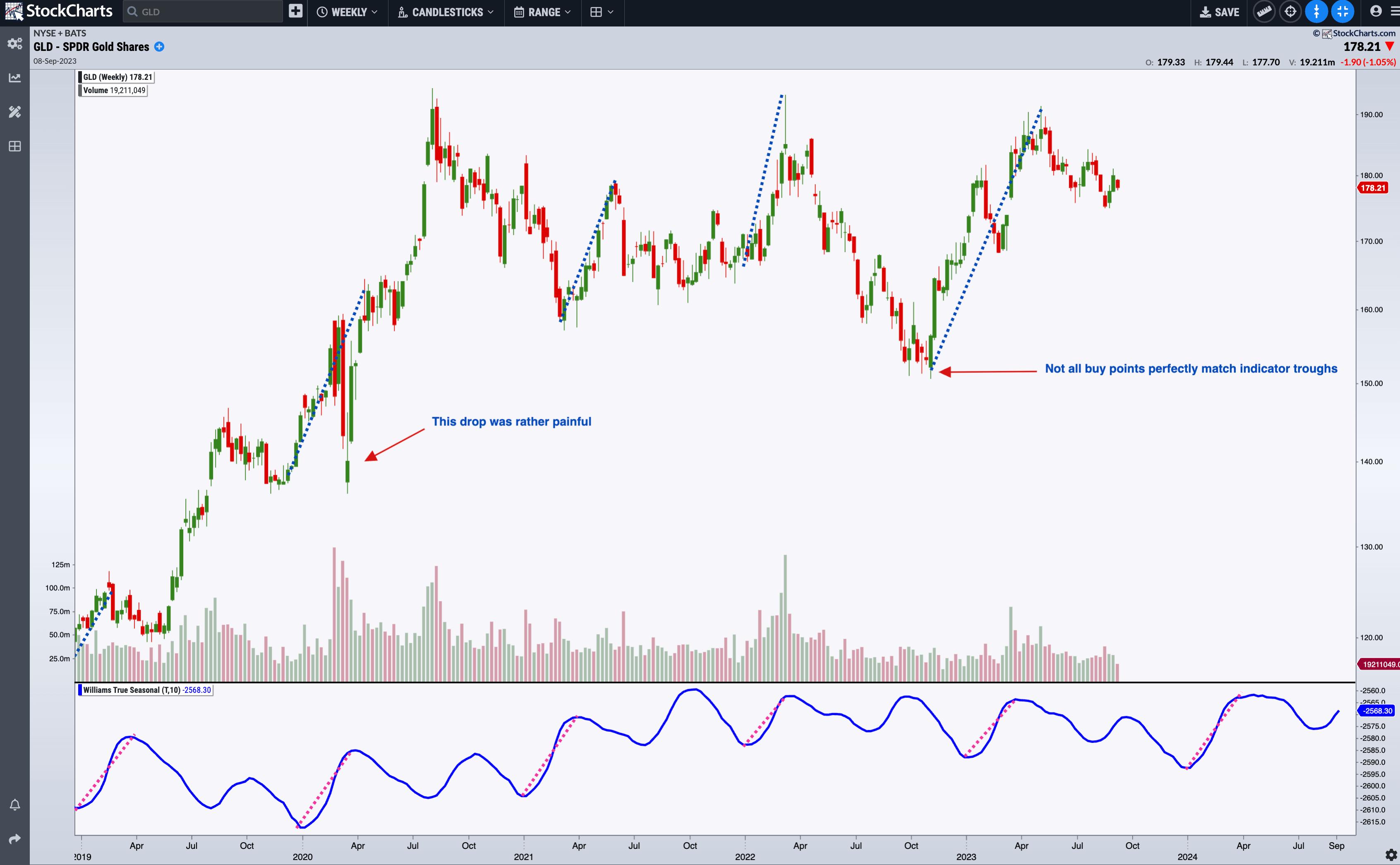
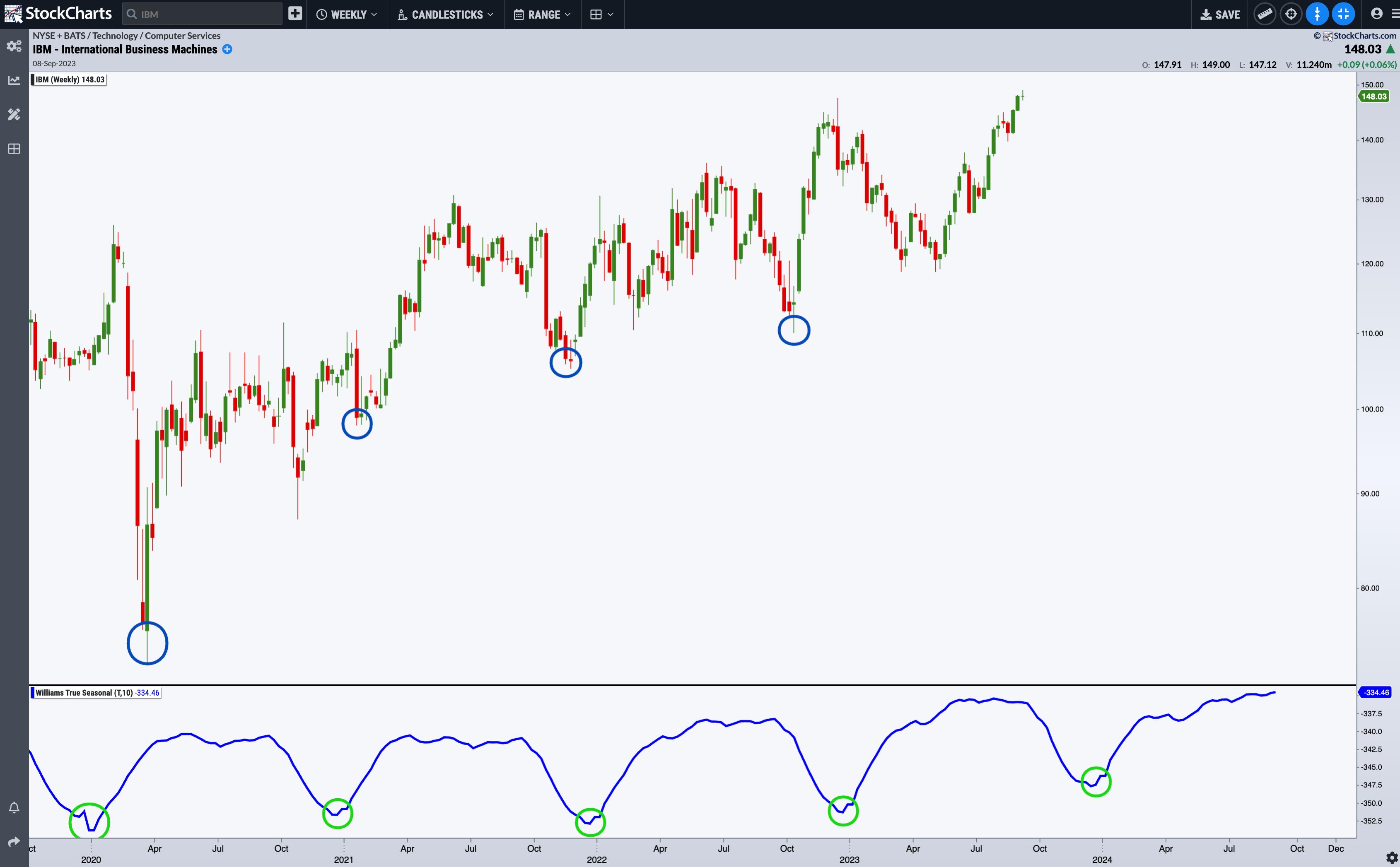
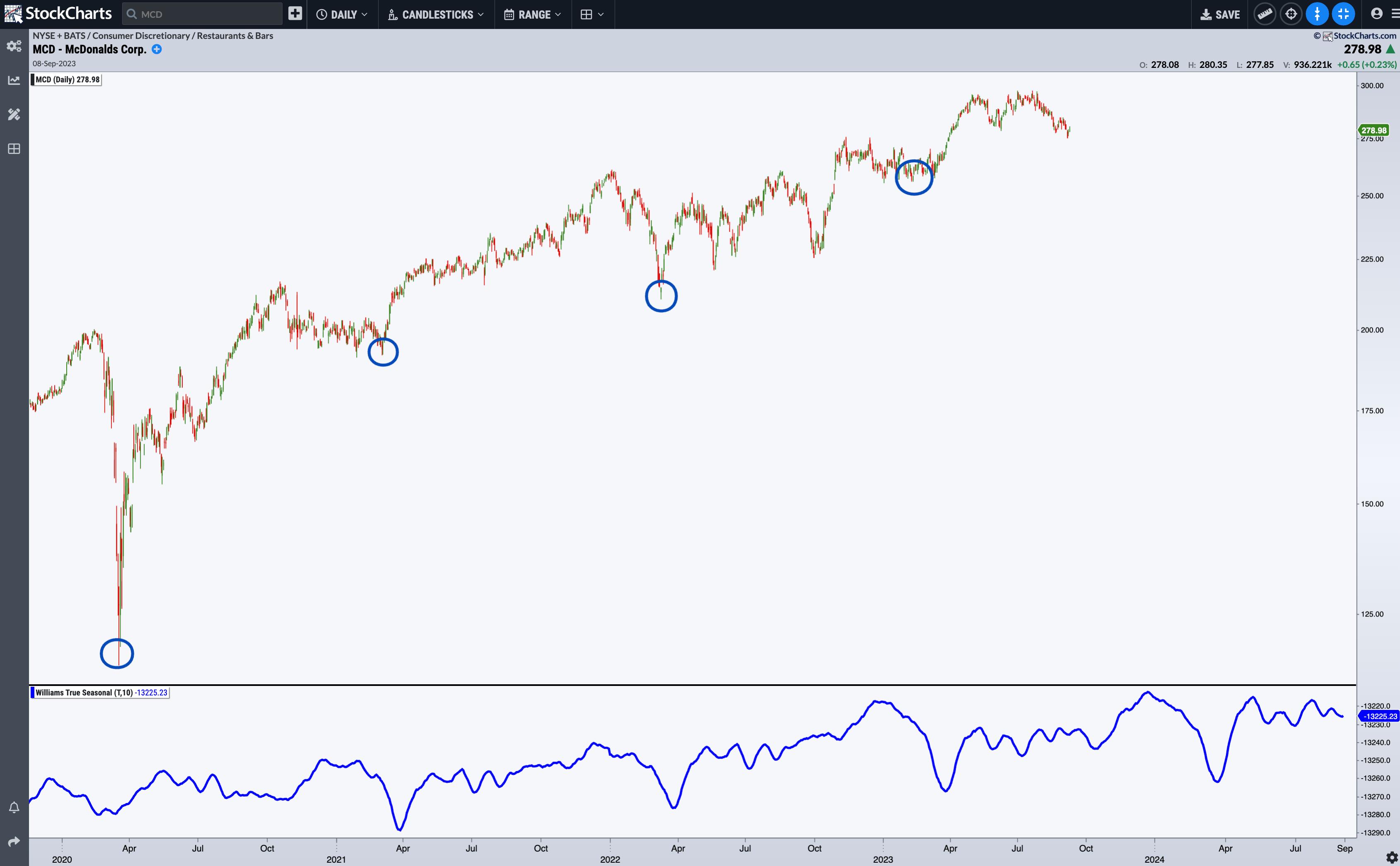
The Williams True Seasonal indicator is available in StockChartsACP as a plug-in.

Once you’ve installed it, scroll down the available indicators list (it’s below the standard indicators), select Williams True Seasonal, and you’ll be ready to apply this indicator to your analysis.


Looking closely at the Williams True Seasonal indicator, note the following:

  • GLD tends to rise before the beginning of the year and peaks in April.
  • Note how the pink dashed line highlighting this peak-to-trough in the Williams True Seasonal correlates with the blue dashed line on GLD’s price chart.
  • Note that the April peaks look differently depending on whether GLD is trending or not (and this can affect the way you trade GLD).
  • According to this seasonal pattern, it would be wise to buy gold toward the end of the year; if the market is not trending upward, it might even be a wise decision to sell around April. Come this December, will the end of 2023 offer another compelling buy point?
  • Still, you have to be flexible, as not all buy (or sell) points match perfectly with the indicator (although it comes pretty close to it), and some volatile moves, such as the one we saw in 2020, can occur.

Next, let’s look at a weekly chart of IBM.

CHART 2: WEEKLY CHART OF IBM. Seasonal demand for IBM products may correspond with annual business spending toward the first of the year.Chart source: StockChartsACP. For educational purposes.

IBM makes for an ideal case because its seasonal peaks and troughs are so well-defined. IBM’s buy point is toward the beginning of the year. In 2020, the big COVID Crash may have offset this seasonal trend, but it remained intact despite the uncertainties that pervaded global markets and economies. The Williams True Seasonal projects another buy point in 2024. That could mean IBM’s share price might dip before resuming this seasonal trend.

Now, let’s look at the Williams True Seasonal applied to daily charts.

CHART 3: DAILY CHART OF MCDONALDS (MCD). Do the troughs in the Williams True Seasonal indicator signal more burger cravings and spending or investment at the end of the first quarter of the year?Chart source: StockChartsACP. For educational purposes.

Since the decline in 2020, McDonald’s (MCD) began exhibiting seasonal buy points in late March. The dips in the Williams True Seasonal indicator are quite pronounced, and although the market action corresponding to these buy points varies slightly, MCD has generally been on an uptrend, and the next buy point signal may take place again in late March, should the seasonal trend continue.

The Bottom Line

The Williams True Seasonal is not so much a timing indicator as it is an early warning signal and a stock selection tool. Trading the markets with a clear view of seasonality patterns can give you a significant advantage. While the Williams True Seasonal is a potent tool, combining it with other indicators he developed, such as those for timing markets, can help sharpen your approach and trading performance.


Disclaimer: This blog is for educational purposes only and should not be construed as financial advice. The ideas and strategies should never be used without first assessing your own personal and financial situation, or without consulting a financial professional.