Category

Stock

Category

When major shifts happen in the market, such as the one we’re seeing the morning after the election, how can you analyze investor sentiment shifts and adapt your strategy to align with where money will likely flow in the coming weeks and months?

If you checked the markets on Wednesday morning, post-election, you woke up to several remarkable events:

The stock market shot up to a record high, with the Dow jumping 1,300 points and the Russell 2000 soaring as high as 4%.The yield on the US 10-year bond surged 4.48%, indicating expectations of economic growth and wider deficits.The US dollar rose the most since 2020 while foreign currencies sank.Gold prices stabilized, though they were down nearly 2% from the metal’s October high.Silver, attempting to stabilize as well, remains down a whopping 7% from its October high.

The big question: Do these shifts signal a confident pivot to “risk-on,” or is the market’s optimism overextended?

Price action will tell you directly what investors are expecting out of the markets in the near-to-intermediate term, but to get an even clearer picture, it’s best to analyze the undercurrents driving market sentiment. Perhaps there, you’ll see what most investors looking at price action or following the news cannot.

A Look at Safe Havens vs. Equities

Since the focus here is on “risk on vs. risk off” sentiment, let’s compare two safe havens, gold ($GOLD) and silver ($SILVER), to the S&P 500 ($SPX).

FIGURE 1. COMPARATIVE CHARTS OF GOLD, SILVER, AND THE S&P 500. All three declined since October, but the S&P jumped following Tuesday’s election. Chart source: StockChartsACP. For educational purposes.

While gold and silver’s uptrend are still intact, with silver showing more weakness than gold, the S&P 500 shows a positive jolt in money flow compared to the defensive monetary metals. This picture also tells us that market sentiment, at least for the moment, favors economic growth prospects over fears of potential tariff-driven headwinds.

The flow into domestic equities and the outflow from international currencies, likely in anticipation of increased tariff activity, are most evident in the forex market, where the US dollar index (UUP as a proxy) rose higher while the $EURUSD dropped following the election.

FIGURE 2. COMPARATIVE CHART OF THE DOLLAR INDEX VS EURUSD. Money could be flowing from international currencies and into US stocks due to tariff fears.Chart source: StockChartsACP. For educational purposes.

Still, we need to take a closer look at market sentiment from a level deeper than what we can see on the surface. Let’s shift to a daily chart of the S&P 500.

FIGURE 3. CHART OF THE S&P 500. The two sentiment indicators based on surveys of investors and professional money managers show that investors are cautious, whereas the institutions are bullish.Chart source: StockCharts.com. For educational purposes.

Before you look at the price action, note the two sentiment indicators below the chart. Both are weekly surveys.

The first indicator—the American Association of Individual Investors (AAII) index (!AAIIBULL)—is a survey of members who represent the individual or “retail” crowd. The survey simply asks whether they’re bullish, bearish, or neutral. A reading over 50% means that 50% or more members are bullish on the markets.  Right now, 39.50% of the members are bullish, down from 50% in October, while bearish sentiment has risen to 30.90% (from just under 20% last month). If you were to use this indicator as a contrarian, the current signal tells you that investors are, at best, cautiously optimistic leading up to election day. It’ll be interesting to see how this changes in the coming days when the new levels are reported.

The second indicator—National Association of Active Investment Managers (NAAIM) index (!NAAIM)—reflects the average exposure of professional money managers (the institutional ‘smart money’) to U.S. equity markets. Basically, its members report their equity exposure. Like the AAII index, contrarians look for readings near 100 as a sign of possible distribution (and readings close to 10% as a sign of possible accumulation). Currently, with 82% of managers holding equity exposure, it’s a bullish signal, though not too bullish as to indicate euphoria.

The Chaikin Money Flow (CMF), a momentum indicator, has dipped below the zero line, meaning that selling pressure has overtaken buying pressure. This suggests a pullback is likely, though, given the post-election uncertainty, you’d have to watch the markets closely to see what it does.

The market is generally bullish but not by any means euphoric. The breakaway price gap you see on the chart is a very bullish pattern that, historically at least, can continue for days without the gap getting filled. With that said, potential support following a pullback will have to be measured once the pullback finally occurs (which isn’t now). But, if the near-term trend is indeed strong, expect price to remain above the support level at roughly the $5,688 range, which is also a critical swing low and support for the current trend.

In short, market sentiment is leaning toward a cautious risk-on sentiment. And despite money flow hinting at a pullback, based on the indicators, that’s likely an opportunity for accumulation rather than distribution.

At the Close

Post-election, investors appear to be leaning toward the “risk-on” vibe. Big players keep a solid equity exposure, while retail investors are more measured but still bullish. While the market’s upbeat, it’s by no means euphoric—yet. So, closely watch those support levels, sentiment indicators, and price action (namely, any pullback when it occurs) to see if this cautious optimism sticks or fades.

Disclaimer: This blog is for educational purposes only and should not be construed as financial advice. The ideas and strategies should never be used without first assessing your own personal and financial situation, or without consulting a financial professional.

Now that election uncertainty is over, the stock market broke out of its sideways trading range and continued higher. Potential policy implementations benefit some asset classes, such as cryptocurrencies, which could operate in a more relaxed regulatory environment.

Coinbase Global Inc. (COIN), a crypto-related stock, made it to the top of the Top Up Large Cap stocks in the StockCharts Technical Rank (SCTR) Reports on Wednesday, the day after the US elections.

FIGURE 1. COINBASE IN TOP POSITION. A 65.7 rise in the SCTR score is an impressive one day jump.Image source: StockCharts.com. For educational purposes.

The weekly chart of Coinbase stock shows a series of lower highs and lower lows from March 2024. COIN has broken above the upper channel line, but it’s just the beginning. More momentum needs to be behind Coinbase’s stock price to see follow-through in this movement.

FIGURE 2. WEEKLY CHART OF COINBASE. Since March 2024, COIN has been consolidating. With Wednesday’s price action, the stock price broke through the upper channel of the consolidation pattern.Chart source: StockCharts.com. For educational purposes.

The daily chart (see below) shows that the uptrend has started. Coinbase’s stock price gapped up and closed near its daily high on strong volume.

FIGURE 3. DAILY CHART OF COINBASE. Wednesday’s gap up in COIN is encouraging. Will there be enough momentum for a follow-through? Chart source: StockCharts.com. For educational purposes.

COIN is trading above its 21-day exponential moving average (EMA), its SCTR score crossed over 76, and its relative strength index (RSI) is getting close to the 70 level.

When To Buy COIN

I would look at the weekly chart to identify the entry point. Since COIN has broken out of its downward channel, an ideal scenario would be if the stock price pulled back a bit and reversed, at which point I would look for an entry point at around $250. The RSI should also be greater than 70. The first resistance level to watch for would be around $265, a previous high. If COIN pushes through that level, the next level would be $280. It could go even higher if the momentum is behind it. COIN’s all-time high is $429.54.

If owning shares of Coinbase is a stretch at current price levels and you have signed up for the OptionsPlay Add-on, consider trading options on the stock. Below the chart, under Tools & Resources, click on Options, then the OptionsPlay button.

FIGURE 4. OPTIONS STRATEGIES TO TRADE COINBASE. You can see up to three optimal options strategies depending on your directional bias and implied volatility.Image source: StockCharts.com. For educational purposes.

By default, three strategies will be displayed for a bullish scenario. In the screenshot above, the Jan 17 250/340 call vertical has a relatively decent reward for a max risk of $2,600. Click the expand icon at the top right to see more details.

The stock trend doesn’t meet this trade’s requirements. You could modify the legs to see if another strike price or expiration will meet the trend requirement. Another option is to close this window and try out a bearish or high implied volatility environment to see if you get a more optimal strategy.

FIGURE 5. CALL VERTICAL DETAILS. You can get more granularity for the call vertical when you click the expand icon. All except stock trend checks off in the strategy checklist.Image source: StockCharts.com. For educational purposes.

Once you’ve found a strategy you’re comfortable trading, click the Trade button and copy the trade to your trading platform if you have an options-enabled trading account.

The Bottom Line

Coinbase stock has the potential to rise higher, but a one-day jump in price shouldn’t be your entry criteria. You must still analyze the chart and decide on an entry and exit point that works for your risk tolerance level. Add COIN to your ChartLists and, if possible, set an alert for an entry point. Once you have a position open, follow smart risk management strategies and be prepared to exit a position once it has crossed your exit threshold. You never lose money when taking profits early.

Disclaimer: This blog is for educational purposes only and should not be construed as financial advice. The ideas and strategies should never be used without first assessing your own personal and financial situation, or without consulting a financial professional.

In this exclusive StockCharts video, Joe shows a specific trade setup in multiple timeframes that identifies the start of an important trend. He explains the 4 keys to this setup and shows 5 examples of stocks meeting the criteria right now. Joe then covers numerous indices, commodities, 10-year Rates, and Bitcoin, and how they are reacting to the election. Finally, he goes through the symbol requests that came through this week, including AMZN, AAPL, and more.

This video was originally published on November 6, 2024. Click this link to watch on StockCharts TV.

Archived videos from Joe are available at this link. Send symbol requests to stocktalk@stockcharts.com; you can also submit a request in the comments section below the video on YouTube. Symbol Requests can be sent in throughout the week prior to the next show.

Back in the day, I used to look at the weekly S&P 500 chart every weekend and ask myself the same three questions:

What is the long-term trend?What is the medium-term trend?What is the short-term trend?

My goal was to make sure that I was respecting the broader market direction, and not fighting it by taking too many contrary positions in my portfolio.  I eventually realized through some trial and error that I could use a series of weekly exponential moving averages to get me to the same place, allowing me to spend more time focusing on what was coming next.

The Construction of the Market Trend Model

As I discussed with Mike Turner in a recent episode of the Market Misbehavior podcast, staying on the right side of market trends is arguably the most important role for any investor.  I realized that by comparing the 21 and 34-week exponential moving averages every week, I was able to clearly define uptrends and downtrends over long-term time frames.

Our short-term Market Trend Model turned bearish on November 1, 2024.

To try and address the lagging nature of such a long-form moving average combination, I added the 5 and 13-week exponential moving averages and found that the signals provided gave me a better signal to track what I consider the medium term time frame of about a couple months.  

I finally added a short-term signal, making a comparison of Friday’s weekly close to the 5-week exponential moving average.  As you can see from the chart above, the PPO indicator allows a very easy and visually attractive method to track these comparisons and recognize shifts from bullish phase to bearish phase.

The Short-Term Model Turned Bearish… Now What?

On Friday, November 1st, the short-term model turned negative for only the fourth time in 2024.  Previous bearish signals in August, July, and April had lined up quite well with tactical pullbacks within the fairly consistently bullish year of 2024.  But note how the medium-term and long-term models are still firmly in the bullish camp?

For now, the current configuration makes me comfortable labeling the current trend as short-term bearish but still long-term bullish.  As we’ve noted in recent weeks, the market breadth indicators I follow have certainly suggested a bearish tilt as they have trended lower into November.

But the point of the Market Trend Model is to show how short-term weakness can often occur within bullish primary trends.  The key is to differentiate between the garden variety “buy on the dips” pullback with a pullback that may be the beginning of a more significant drawdown.

Learning From Previous Market Cycles

Look back at 2021 for a similar example of long-term primary uptrend with a series of short-term bearish signals along the way.  Even as the S&P 500 a remarkably strong and low-volatility uptrend, there were a number of hiccups that caused the short-term model to turn negative.

The key in 2021 was that the medium-term and long-term models remained bullish, at least until they didn’t!  In January 2022, the short-term model turned bearish again, and a couple weeks later, the medium-term model pivoted to a negative signal as well.  The long-term model followed suit in May 2024. 

You can add the Keller Market Trend Model to your Market Dashboard!

For now, I’m watching the medium-term model closely for a potential bearish reversal.  If that comes to pass in November, that would mean that once again the market is resisting the normal seasonal tendencies and showing weakness where there is often strength.  But if the medium-term model remains bullish through year-end, that will tell me to remain positioned for potential further upside as the market trends remain positive.

I am a big fan of analyzing price action using subjective methods to evaluate trends based on the traditional tools of the technical analyst.  And I’m also a big fan of making life easier, using systematic trend-following models to make sure I’m on the right side of the primary trend in the markets!

RR#6,

Dave

PS- Ready to upgrade your investment process?  Check out my free behavioral investing course!

David Keller, CMT

President and Chief Strategist

Sierra Alpha Research LLC

Disclaimer: This blog is for educational purposes only and should not be construed as financial advice.  The ideas and strategies should never be used without first assessing your own personal and financial situation, or without consulting a financial professional.  

The author does not have a position in mentioned securities at the time of publication.    Any opinions expressed herein are solely those of the author and do not in any way represent the views or opinions of any other person or entity.

The stock market closed on a down note on Monday. It’s just one day before the general election and, as you know from experience, elections tend to be like an adrenaline shot to the market, the effects of which can last from days to months.

Positioning Yourself for Post-Election Market Stress

Several analysts have hinted that Wall Street may have already priced in a Trump win. If that outcome materializes, and depending on the outcome of the Senate and House races, the markets may readjust, depending on how it forecasts changes in policy and its effect on the economy.

At this stage of the game, with a market poised for adjustments and overreactions, it might work in your favor to get a big-picture view of how sectors will respond in the coming days, and which stocks within those sectors may be gaining strength as the political fog clears.

Scanning the Market in a Rapidly Shifting  Environment

After Monday’s market close, Energy and Real Estate emerged as the top performers, while Utilities and Financials lagged. To quickly scan this outcome, from your StockCharts Dashboard click the arrow next to the Charts & Tools tab and select MarketCarpets. From the Select Group dropdown menu, choose S&P Sector ETFs.

FIGURE 1. MARKETCARPETS CHART OF SECTOR ETFS ON NOVEMBER 4. The Energy sector was the top performer while Utilities was the weakest performer.Image source: StockCharts.com. For educational purposes.

The top-performing sectors were Energy, up 1.74%, and Real Estate, up 1.15%. Energy stocks got a boost after OPEC+ hit pause on planned oil production increases. Meanwhile, real estate stocks rallied thanks to big acquisition moves and some pre-election bets on policy changes that could favor property.

The big losing sectors were Utilities, down 1.17%, and Financials, sliding 0.80%. Utilities dropped as regulatory concerns emerged after FERC blocked a capacity increase for an Amazon-linked nuclear plant. Financials slid amid pre-election uncertainty, with investors wary of potential policy shifts affecting major institutions within the industry.

Let’s zoom in on the Energy sector to see which industries and stocks are outperforming.

FIGURE 2. MARKETCARPETS CHART FOR THE ENERGY SECTOR. Most industries within the sector are bullishly green.Image source: StockCharts.com. For educational purposes.

The size of the squares is weighted by market cap, and the largest and most recognizable outperformer on this list, Exxon (XOM), is up 3.18%. However, the leading performers aren’t all well-known names; you can see these top stocks listed in the table to the right of MarketCarpets among the day’s top 10.

Real Estate is another sector that’s been quietly creeping up. While the stocks comprising it haven’t been making headline news, investors have made their moves in the sector.

FIGURE 3. MARKETCARPETS CHART FOR REAL ESTATE SECTOR. Lots of green, but not many well-known stocks.Image source: StockCharts.com. For educational purposes.

Fangdd Network Group Ltd (DUO) had the largest jump, up 9.09%, but beware—it’s virtually a penny stock despite its high trading volume and market cap, all of which can be seen in its Symbol Summary.

Public Storage (PSA) had a sizable jump, up 2.71%, while Simon Property (SPG) also had a comparable gain of 2.64%. Again, these aren’t necessarily stocks to invest in, but they are large stocks that help paint a picture of what’s driving the sector. It’s up to you to dig deeper using technical tools to assess whether the sector’s strength—or certain stocks within it—might offer a potential opportunity.

Those were Monday’s strongest sectors. Now let’s look at the weakest sectors in the market.

FIGURE 4. MARKETCARPETS CHART OF THE UTILITIES SECTOR. The sector was dragged down by its largest stocks.Image source: StockCharts.com. For educational purposes.

The regulatory ruling that impacted Constellation Energy Corp. (CEG), causing a 12.46% drop, pulled down the entire Utilities sector. Public Service Enterprise (PEG) faced the next biggest loss, falling 6.23%. While there were a few gainers, none were particularly well-known names.

The manner of Utilities’ decline differs from the Financial sector, as you will see below.

FIGURE 5. MARKETCARPETS CHART OF THE FINANCIAL SECTOR. Bearish pretty much all the way around.Image source: StockCharts.com. For educational purposes.

While negative sentiment painted the financial sector with broad strokes, none of the biggest losers were any of the sector’s heavyweights. But again, neither were its biggest winners. This is the market expressing its pre-election jitters. Weighing the prospect of continuing inflation, whether it’s driven by tariffs or fiscal spending, there seems to be no clear path out of the price conundrum, and that’s what we’re seeing in the sector.

So, what might you do next?

How To Position Yourself During and After the Election

Here are five MarketCarpets tips.

Identify Sector Trends Quickly. Get a fast, visual snapshot of which sectors are leading and lagging.Monitor Sector Performance. Focus on sectors that are sensitive to policy outcomes.Look for Surprising Movers. Sometimes, the largest stock movers aren’t the sector’s heavyweights, and sometimes they are. Use MarketCarpets’ display to identify these changes quickly.Drill Down to Industry-Specific Strengths. Zoom into individual sectors on MarketCarpets to see which industries within sectors are performing best.Look for Signs of Rapid Reversal. Post-election, stocks and entire sectors might overreact to news, leading to quick sell-offs or rallies. Follow the MarketCarpets to catch any quick reversals in sectors or stocks that signal re-adjustment and drill down on each stock using your preferred technical tools. You might find opportunities early on.

At the Close

MarketCarpets can be a reliable tool for making sense of post-election market chaos. It gives you a clear snapshot of sector trends, showing which areas are gaining or lagging as the market reacts to the evolving political realities. By highlighting top performers, undervalued plays, and industry-specific movers, you can spot the biggest opportunities quickly before swooping in for a deeper dive into your targets.

Disclaimer: This blog is for educational purposes only and should not be construed as financial advice. The ideas and strategies should never be used without first assessing your own personal and financial situation, or without consulting a financial professional.

In this video, Dave breaks down the three time frames in his Market Trend Model, reveals the short-term bearish signal that flashed on Friday’s close, relates the current configuration to previous bull and bear market cycles, and shares how investors can best track this model to ensure they’re on the right side of the market trends!

This video originally premiered on November 4, 2024. Watch on our dedicated David Keller page on StockCharts TV!

Previously recorded videos from Dave are available at this link.

It’s here! The SPY starts a period of favorable seasonality for the next six months. Carl takes us through his charts and explains favorable versus unfavorable periods of seasonality.

Carl covers our signal tables showing new weakness seeping in despite this period of favorable seasonality. The market looks toppy right now.

Today’s market overview covers the weakness that has been developing throughout the market. He also covers Gold, the Dollar, Yields, Bonds, Bitcoin, Gold Miners and Crude Oil among others!

Carl also walks us through the Magnificent Seven in both the short and intermediate terms. Which ones are holding up and which are showing signs of weakness?

Erin drops in on sector rotation discussing the breakdown of nearly all sectors. No sectors hold rising PMOs as of airing of the trading room.

The pair finish the program by looking at viewer symbol requests with an eye toward relative strength and momentum.

01:26 Seasonality Discussion

02:52 Bias Chart and DP Signal Tables

06:41 Market Overview

12:56 Magnificent Seven

19:54 Questions

23:44 Sector Rotation

29:45 Symbol Requests

Join us live in the trading rooms on Monday at Noon ET! Register here: https://zoom.us/webinar/register/WN_D6iAp-C1S6SebVpQIYcC6g#/registration

Try out any of our subscriptions for two free weeks by using coupon code: DPTRIAL2 at checkout!

Introducing the new Scan Alert System!

Delivered to your email box at the end of the market day. You’ll get the results of our proprietary scans that Erin uses to pick her “Diamonds in the Rough” for the DecisionPoint Diamonds Report. Get all of the results and see which ones you like best! Only $29/month! Or, use our free trial to try it out for two weeks using coupon code: DPTRIAL2. Click HERE to subscribe NOW!

Learn more about DecisionPoint.com:

Watch the latest episode of the DecisionPointTrading Room on DP’s YouTube channel here!

Try us out for two weeks with a trial subscription!

Use coupon code: DPTRIAL2 Subscribe HERE!

Technical Analysis is a windsock, not a crystal ball. –Carl Swenlin

(c) Copyright 2024 DecisionPoint.com

Disclaimer: This blog is for educational purposes only and should not be construed as financial advice. The ideas and strategies should never be used without first assessing your own personal and financial situation, or without consulting a financial professional. Any opinions expressed herein are solely those of the author, and do not in any way represent the views or opinions of any other person or entity.

DecisionPoint is not a registered investment advisor. Investment and trading decisions are solely your responsibility. DecisionPoint newsletters, blogs or website materials should NOT be interpreted as a recommendation or solicitation to buy or sell any security or to take any specific action.

Helpful DecisionPoint Links:

Trend Models

Price Momentum Oscillator (PMO)

On Balance Volume

Swenlin Trading Oscillators (STO-B and STO-V)

ITBM and ITVM

SCTR Ranking

Bear Market Rules

Good morning and welcome to this week’s Flight Path. Equities saw the “Go” trend remain in place this week but we saw weakness with a few aqua bars. GoNoGo Trend shows that the “NoGo” trend strengthened at the end of the week in treasury bond prices. U.S. commodities hung on to the “Go” trend and indeed we saw strength with bright blue bars. The U.S. dollar also remained in a “Go” trend but the indicator paints weakness with aqua bars.

$SPY Shows Weakness with a Pair of Aqua Bars

The GoNoGo chart below shows that we still have been unable to conquer the high from last month. This week saw price gap lower and weaker aqua bars return as price fell further. If we turn our attention to the oscillator panel we can see that after holding at the zero level for a few bars we have broken down into negative territory and volume has increased. We will watch closely to see if this further threatens the “Go” trend that is currently in place.

The longer time frame chart tells us that the trend remains strong but we see another lower weekly close this week after the Go Countertrend Correction Icon (red arrow) we recently noted above price. As price approaches the last high from the summer we will watch to see if it finds support. GoNoGo Oscillator is falling but still in positive territory so we will pay attention to what happens as it gets closer to the zero line.

Treasury Rates Remain in Strong “Go” Trend

Treasury bond yields saw the “Go” trend continue this week and after a couple of weaker aqua bars the week closed with strong blue “Go” colors after price made another higher high this week. GoNoGo Oscillator shows that momentum is still in positive territory but no longer overbought as it falls to a value of 3. We will look for support at the zero level if and when it gets there.

The Dollar Sees Weakness in “Go” Trend

We saw another Go Countertrend Correction Icon (red arrow) this week right after price made a new high. Since then we have seen consecutive aqua bars that demonstrate some trend weakness.  Price rebounded on Friday with a strong bar and so we will watch to see if the trend will strengthen as it approaches prior highs. GoNoGo Oscillator fell sharply but turned around at a value of 1 and so is now rising at a value of 3 confirming the “Go” trend in the price panel.

There is only one way to trade in a long-term uptrend: long. Forget about picking tops and breaks below short-term moving averages. Leaning bearish within a long-term uptrend is not a profitable strategy. Instead, we should lean bullish and use oversold conditions to our advantage.

In a long-term uptrend, I am only interested in oversold conditions because these provide setups to trade in the direction of the bigger trend. I ignore overbought conditions because it is normal to become overbought in an uptrend. Oversold conditions, on the other hand, occur after a pullback and this is an opportunity to partake in the long-term uptrend.

The chart below shows SPY with two momentum oscillators: RSI(10) and %B(20,2). I am using both to identify oversold conditions in a long-term uptrend. SPY is well above its rising 200-day SMA (blue line) so the long-term trend is clearly up. %B tells us the location of the close relative to the Bollinger Bands. The indicator dips below 0 when the close is below the lower Band and this is an oversold condition. RSI becomes oversold with a dip below 30.

On the chart above, we can see %B becoming oversold in mid April, late July and last week (green shading). RSI became oversold in mid April and early August, but has yet to become oversold here in early November. On the price chart, notice that SPY is trading near its 50-day SMA (pink line). Prior dips below the 50-day SMA marked pullbacks within the bigger uptrend, not the start of a bigger trend change.

Oversold conditions are not the signal. Oversold conditions simply serve as an alert to be on guard for a short-term reversal. Keep in mind that price can become oversold and remain oversold. Chartists, therefore, need a bullish catalyst to signal a change from oversold to strength. For RSI and %B, we can use their centerlines to identify an upturn in momentum. The chart below shows these centerlines as short red lines (50 for RSI and 0 for %B). 

A bullish signal triggers when RSI becomes oversold and then breaks above 50, while a bullish signal triggers when %B becomes oversold and then breaks above 0. The green arrows show breakouts in late April and mid August. %B became oversold last week and has yet to break above 0. Thus, it is still in oversold condition. RSI did not become oversold. I would like to see both become oversold and then look for the momentum breakouts.

Special Offer!! 

2 Educational Reports/Videos with Every Subscription

“Finding Bullish Setup Zones with High Reward Potential and Low Risk”. The trend is your friend, and pullbacks within uptrends present opportunities. We show how to find compelling setups that combine market conditions, trend identification, oversold conditions and trading patterns. Trading is all about the odds and these setups put the odds in your favor.

“Using Breadth for Capitulation, Thrusts, Market Regime and Oversold Conditions”. This report covers four ways to utilize breadth indicators. Capitulation conditions often signal major lows, while thrust signals indicate the start of a bullish phase. Market regime helps distinguish between bull and bear markets, and oversold conditions identify tradable pullbacks within bull markets. We explain the indicators, settings, and signals for each scenario.

Click here for immediate access!

Highlights from Chart Trader (Weekly Reports/Videos):

November 1st Report: Stocks pulled back the last two weeks and we showed five breadth indicators to identify oversold conditions. We are also monitoring the September breakouts and key support levels for QQQ, MAGS, XLK and five other tech-related ETFs. Plus a bearish pattern in SMH. With recent pullbacks, we are seeing oversold conditions in two ETFs and bullish setups in two Healthcare stocks.

October 25th Report: The weight of the evidence remains bullish, but the surge in the 10yr Yield is concerning. We quantify the recent surge and show how stocks reacted to past surges. We continue to monitor the cup-with-handle breakout in SPY, as well as the triangle breakouts in QQQ and the tech-related ETFs. This report also featured trade setups in ETFs and stocks related to industrial metals.

Click here for ChartTrader access!

System Trader: Quantified Strategies with Weekly Signals

Rotation Trader for S&P 500 Stocks (+37% in 2024)

Rotation Trader for Nasdaq 100 Stocks (+14% in 2024)

Rotation Investor for S&P 500 Stocks (debuting this week)

Rotation Investor for Nasdaq 100 Stocks (debuting this week)

Click here for SystemTrader access!

//////////////////////////////////////

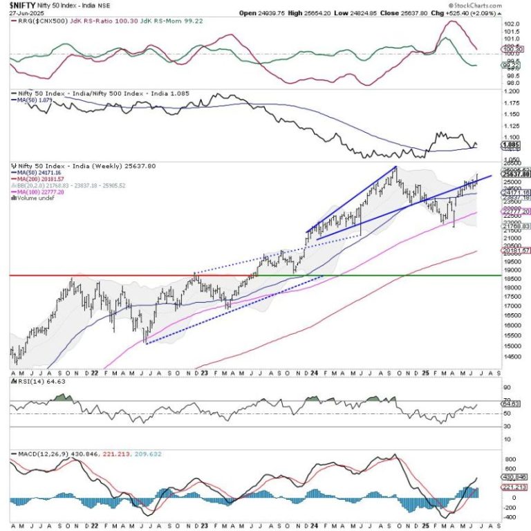
The Nifty largely consolidated over the past five sessions but did so with a bearish undertone. The Nifty traded in a defined range and closed the week with a modest gain. Importantly, the index also stayed below its crucial resistance points. The volatility also expanded; the India VIX surged higher by 8.68% to 15.90 on a weekly basis. Given the ranged move by the markets, the trading range got narrower. The Nifty oscillated in a 363-point range; this was much less than the previous week. Following a largely consolidating but bearish setup, the headline index closed with a modest weekly gain of 123.55 points (+0.51%).

It was a four-day trading week as Friday just had a short one-hour symbolic ceremonial Mahurat Trading session. In the week before this one, the Nifty had violated and closed well below the 100-DMA which currently stands at 24669. The Index has also violated the 20-week MA placed at 24744. This makes the zone of 24650–24750 the most important market resistance area. So long as the Nifty stays below this zone, no trending and sustainable upmove shall occur in the markets. In other words, so long as the Nifty stays below this crucial resistance zone, it remains vulnerable to continued selling pressure. The most immediate support zone for the Nifty now stands at 23900; the markets would get weaker if this level is breached on the downside.

The global markets are expected to give a stronger handover; given this thing, the Indian markets may see a stable start to the week on Monday. The levels of 24450 and 24580 would act as immediate resistance points. The supports come in at 24120 and 23900.

The weekly RSI stands at 51.24; it remains neutral and does not show any divergence against the price. The weekly MACD is bearish and trades above the signal line.

The pattern analysis of the weekly charts shows strong momentum on the downsides for Nifty. The 20-DMA is showing a steep decline; it has already crossed below the 50-DMA and it is about the cross below the 100-DMA as well. This indicates strong selling pressure and has increased the possibility of the Nifty staying in an intermediate downtrend for some more time. The resistances have been dragged lower; technical rebounds, as and when they happen, would find resistance between 24650-24750 levels.

All in all, even if the Nifty gets a stable and firm start to the week, it is not out of the woods as yet. Any technical rebounds, as and when they take place, should be chased very cautiously. All up moves shall face resistance at the levels of 24600 and higher; there is a greater likelihood that these rebounds are likely to get sold into at higher levels. It is strongly recommended that leveraged positions must be kept at modest levels and all profits on either side must be guarded vigilantly. A highly cautious approach is advised for the coming week.

Sector Analysis for the coming week

In our look at Relative Rotation Graphs®, we compared various sectors against CNX500 (NIFTY 500 Index), which represents over 95% of the free float market cap of all the stocks listed.

Relative Rotation Graphs (RRG) do not show any major change in the sectoral setup. The Nifty Pharma, Services Sector, IT, and Consumption Indices are inside the leading quadrant of the RRG. Even though a couple of them are slowing down in their relative momentum, these groups are likely to relatively outperform the broader markets.

The Nifty FMCG and Midcap 100 index are the only two groups inside the weakening quadrant; they may also continue to slow down on their relative performance against the broader markets.

The PSU Bank Index, Realty, Infrastructure, Media, PSE, Auto, Energy, and Commodities indices are inside the lagging quadrant. Among these, the Energy, Auto, PSE, and Media Index may relatively underperform the broader markets. The rest are improving sharply on their relative momentum and may eventually improve their relative performance against the broader market.

The Nifty Bank, Metal, and Financial Services index are inside the improving quadrant and may continue improving their relative performance against the broader markets.

Important Note: RRG™ charts show the relative strength and momentum of a group of stocks. In the above Chart, they show relative performance against NIFTY500 Index (Broader Markets) and should not be used directly as buy or sell signals.  

Milan Vaishnav, CMT, MSTA

Consulting Technical Analyst

www.EquityResearch.asia | www.ChartWizard.ae

Generated by Feedzy