Category

Stock

Category

Joe kicks off this week’s video with a multi‑timeframe deep dive into the 10‑year U.S. Treasury yield (TNX), explaining why a sideways coil just below the 5% level could be “downright scary” for equities. From there, he demonstrates precise entry/exit timingwith a combination of ADX, MACD, and RSI. Joe also covers the short-term divergence developing in the QQQ, takes a look at the IWM, and wraps up with some analyses of this week’s viewer symbol requests, including INTC, MU, and more.

The video premiered on June 11, 2025. Click this link to watch on Joe’s dedicated page.

Archived videos from Joe are available at this link. Send symbol requests to stocktalk@stockcharts.com; you can also submit a request in the comments section below the video on YouTube. Symbol Requests can be sent in throughout the week prior to the next show.


The U.S. stock market has been painting a subtle picture recently. While the broader indexes, such as the S&P 500 ($SPX), Nasdaq Composite ($COMPQ), and Dow Jones Industrial Average ($INDU), are indeed grinding higher, the daily movements have been relatively subdued. This is a noticeable shift from the more dynamic action we observed in April.

Investors may be waiting for Wednesday’s May Consumer Price Index (CPI), the results of the U.S.-China trade talks, or the next market-moving news headline. What’s encouraging is the underlying strength in market breadth. We’re seeing a healthy number of one-month new highs across most broader indexes (with the exception of Dow Utilities), Bullish Percent Indexes signaling bullish tendencies, and investors gravitating toward offensive sectors vs. defensive ones.

On the surface, everything points to a continuation of the bullish trend. However, as astute investors, our primary objective is to protect our capital. This means we mus always consider the possibility of a downside correction and be prepared to adapt.

This is where the StockCharts Market Summary page becomes an indispensable tool for your market analysis.

Let’s dive into how the Market Summary page can help you gain a unique perspective on market dynamics.

Beyond the Headlines: Uncovering Global Trends

One of the powerful features of the Market Summary page is its ability to provide a global snapshot. If you navigate to the Global Snapshot tab in the Equities panel and sort the “+/- SMA(200)” column in descending order, you’ll notice something fascinating: the Eurozone occupies the top spot while the Total US sits at the bottom (see image below).

FIGURE 1. A GLOBAL SNAPSHOT. The Eurozone is trading well above its 200-day simple moving average (SMA) while the Total US is only 4.37% above its 200-day SMA.Image source: StockCharts.com. For educational purposes.

This insightful view suggests that global markets have been trending well above their 200-day simple moving average than the US market. This insight is worth a deeper dive.

Consider the daily charts of the iShares MSCI Eurozone ETF (EZU) and Vanguard Total Stock Market ETF (VTI) which serve as proxies for these regions.

Since April 8, EZU has been on a steep ascent, demonstrating upward momentum. This price action is similar to the S&P 500, but if you consider the relative performance of the SPDR S&P 500 (SPY) vs. EZU, SPY is underperforming EZU (see bottom panel in the chart below).

FIGURE 2. DAILY CHART OF EZU. The ETF is exhibiting a steep ascent and is outperforming SPY. Will the trend become less steep or continue its steep uptrend? Be sure to monitor the RSI.Chart source: StockCharts.com. For educational purposes.

The Relative Strength Index (RSI) is showing lackluster momentum. Generally, a steep trend loses its mojo after a while and reverts to a more normal trend.

Meanwhile, though VTI has also moved higher, its percentage rise was slightly less than EZU. Also, as EZU hit an all-time high, VTI is still trying to reach that milestone (see chart below).

FIGURE 3. DAILY CHART OF VTI. The ETF is also exhibiting a steep ascent but is trying hard to reach its all-time high.Chart source: StockCharts.com. For educational purposes.

The RSI is showing lackluster momentum, similar to that of EZU, which could mean the steep ascent may be losing its steam.

Identifying Global Opportunities

It will be interesting to see how the global financial market evolves from here. Who will be the first to revert to a more normal sloping trend? Will EZU continue its outperformance, or will VTI take the lead?

And let’s not forget the global ETFs positioned in the middle of the pack. Regions like Asia (ex Japan), Latin America, or Emerging Markets could take the lead. For example, the Vanguard FTSE Emerging Markets ETF (VWO) has exhibited a more classic uptrend. Over the past year, it has outperformed SPY by around 127% (see chart below). The RSI is also showing greater momentum than the other charts we analyzed.

FIGURE 4. DAILY CHART OF VWO. This ETF is exhibiting a more normal uptrend and, over the last year, has outperformed SPY by a whopping 127%. RSI is also rising, suggesting there could be momentum here.Chart source: StockCharts.com. For educational purposes.

Empowering Your Stock Market Analysis

To stay ahead of market trends and uncover hidden gems, investors and traders should regularly monitor the charts in the Market Summary ChartLists. If you haven’t already, download the StockCharts Market Summary ChartPack (it’s free for subscribers).

Scrolling through the pre-built ChartLists will help you to:

  • Stay on top of the market’s price action across sectors, industries, and global regions.
  • Identify market internals, such as breadth and sentiment.
  • Uncover some hidden gems that could translate into favorable investment opportunities.


Disclaimer: This blog is for educational purposes only and should not be construed as financial advice. The ideas and strategies should never be used without first assessing your own personal and financial situation, or without consulting a financial professional.


There are a few very different setups unfolding this week that are worth a closer look: two software-related names that are struggling to reclaim their winning ways, plus one lovable and reliable stock wagging its tail in the spotlight. 

Let’s break it down.

Adobe (ADBE): Mind the Gaps

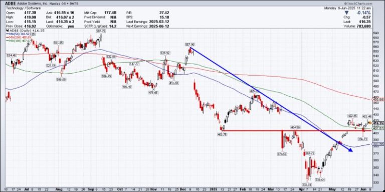
Adobe Systems, Inc. (ADBE) has been a heartbreaker for investors over the last several years. ADBE stock has traded lower after six of its last seven quarterly reports. That includes consecutive losses of nearly -14%. So what should investors be watching this time around?

Coming into Thursday’s release, shares are lower by 6.4% for the year and have just made back their losses from last quarter. Overall, shares remain -35% from all-time highs set back in January 2024.

Investors will be looking for progress on the AI monetization front. Is annual recurring revenue from Adobe’s Firefly and Acrobat products showing a strong growth projection? And, perhaps more importantly, what’s the guidance going to look like? Last quarter, Adobe issued conservative guidance, and shareholders were punished as a result. Will forward-looking guidance meet investor expectations?

Technically, ADBE shares are trying to find that bottom (see chart below). Progress has been made, as the stock is taking minor steps to climb back from the morass.

FIGURE 1. DAILY CHART OF ADBE STOCK. The stock is trading between the 100- and 200-day moving averages. The stock price could gain momentum and move higher or lower after earnings.Chart source: StockCharts.com. For educational purposes.

On the chart, we’re seeing the following signs:

  • Shares have broken their intermediate downtrend.
  • Shares have recaptured the 50-day moving average.
  • Shares have almost filled the downward gap caused by last quarter’s results.
  • Shares have recaptured the 100-day moving average and held for now.

That said, there’s still work to be done, and knowing how this stock gaps in earnings means a move may be coming.

Let’s examine those last three gaps. Each one has been negative, and each time, price action continued in the trend’s direction for several weeks before making a bottom and rallying back. The same thing happened on the last gap up, as momentum in the direction of the gap continued for weeks. Point being, it’s a good idea to watch those gaps. 

ADBE is in a “no man’s land” between key moving averages. The longer-term trend remains down, and it may take a huge report to stay above the 200-day moving average on a rally. It’s one to avoid for now, but the short-term play after earnings may be to go with the momentum of any gap.

Chewy (CHWY): Any New Tricks in Store?

Chewy Inc. (CHWY), the online retailer of pet food and pet-related products, broke out to new highs just last week ahead of this week’s earnings. Shares have been on a roll since their April 7 low, gaining over 60% in that time (see chart below).

FIGURE 2. DAILY CHART OF CHWY STOCK. The stock price has been in beast mode since early April, up more than 60%. With the stock in overbought territory, it could pull back to $44 or $40. Chart source: StockCharts.com. For educational purposes.

Technically, the stock broke out of a textbook rounded bottom base and zoomed to its anticipated upside target of $50. CHWY shares seem overextended as they have been overbought for weeks (Relative Strength Index > 80). The stock price could roll over even on good news, given its recent run. Long-term investors may want to stay in the name and sit on gains.

For those begging for a pullback, there are nice levels of support at $44 and ultimately at $40 if earnings bite investors. This should be a good opportunity to consider this name for your portfolio as the long-term technicals look great, and the company is known for its loyal user base.

Oracle (ORCL): Time to Flip the Script?

Oracle Corp. (ORCL) will report earnings on Wednesday, looking to snap a two-quarter losing streak. Shares of the software giant have rallied nicely off their lows, but are still -13% from their December peak. Investors would like to see its cloud revenue growth continue to expand thanks to agreements with OpenAI, Meta, and Nvidia.

The one concern is the continued capital spending necessary to power the data centers required to meet AI demand. Are the company’s recent capital expenditures putting pressure on margins and impacting ORCL stock’s bottom line? 

Technically, shares have been on a nice run, eclipsing key levels to get back on track. Longer-term, the stock price started the week above its downtrend line, with respect to annual highs.

FIGURE 3. DAILY CHART OF ORCL STOCK. From a technical perspective, the stock price has broken above a long-term downtrend. Will upside momentum continue after earnings? Keep an eye on this stock.Chart source: StockCharts.com. For educational purposes.

The rally looks similar to many other technology names that are trying to get back to their old highs. The good news is that, given the change in trajectory, even weakness looks to have a soft landing spot and good entry point from a risk/reward perspective.

The stock reminds me of the S&P 500 ($SPX) a little bit — struggling to get to new highs and losing a bit of momentum. A pullback to its 200-day moving average around $163 would be a natural retracement — a flag if you will — and a good entry point on any drawdown after positive news.

If any signs of strength emerge, look for shares to run into the $190s before stalling again.

The Bottom Line

We have three different stories unfolding:

  • ADBE’s stock needs to clear earnings hurdles and reclaim trust.
  • CHWY’s stock is on fire, but might need to cool down.
  • ORCL’s stock is rebuilding momentum, and has potential upside if cloud numbers impress.

Sector Rotation: A Week of Stability Amidst Market Dynamics

Last week presented an intriguing scenario in our sector rotation portfolio.

For the first time in recent memory, we witnessed complete stability across all sector positions — no changes whatsoever in the rankings.

  1. (1) Industrials – (XLI)
  2. (2) Utilities – (XLU)
  3. (3) Consumer Staples – (XLP)
  4. (4) Communication Services – (XLC)
  5. (5) Financials – (XLF)
  6. (6) Technology – (XLK)
  7. (7) Real-Estate – (XLRE)
  8. (8) Materials – (XLB)
  9. (9) Consumer Discretionary – (XLY)
  10. (10) Healthcare – (XLV)
  11. (11) Energy – (XLE)

Weekly RRG: Steady as She Goes

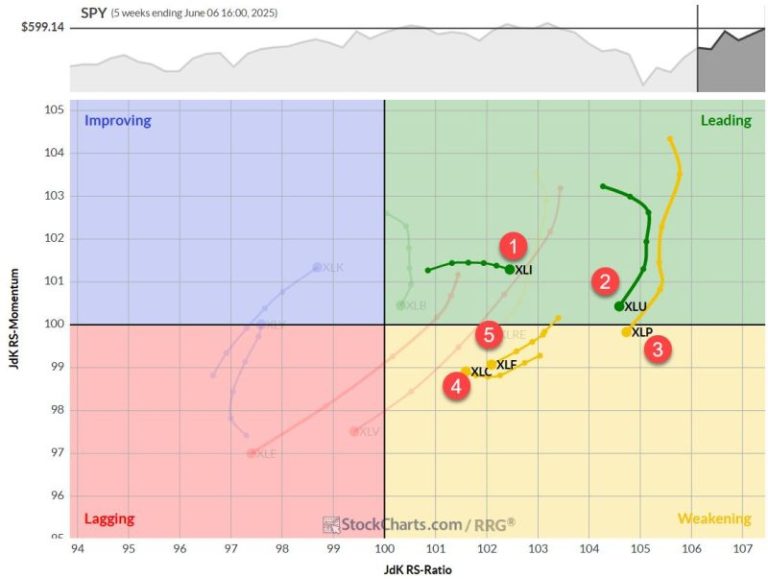
The weekly Relative Rotation Graph (RRG) continues to paint a picture of gradual shifts. Utilities and Consumer Staples, while still occupying high RS ratio levels, are moving lower on the chart. Utilities clings to the leading quadrant, but Consumer Staples has just crossed into weakening territory.

Financials and Communication Services remain in the weakening quadrant, but their RS momentum levels have stabilized. Communication Services shows a slight uptick, while Financials maintains a negative heading — albeit well above the 100 mark.

Industrials, our current star performer, continues its reign in the leading quadrant. It’s gaining ground on the RS-ratio axis while experiencing a minor dip in RS momentum. All in all, the weekly picture remains essentially unchanged from last week.

Daily RRG

Shifting our focus to the daily RRG, we start to see more nuanced movements:

  • Staples and Utilities are rotating within the improving quadrant, losing ground on the RS momentum axis without gaining in RS ratio. This suggests further weakening on the weekly chart is likely.
  • Financials have made their way into the improving quadrant — a positive development that builds on last week’s progress.
  • Communication Services is practically aligned with the benchmark (SPY), showing little distinctive movement.
  • Industrials continues deeper into the weakening quadrant, but — and this is crucial — its RRG velocity (the distance between tail nodes) is very low. This keeps the door open for a potential curl back up before hitting the lagging quadrant, which would reinforce its strong position.

Industrials: Breaking New Ground

The price chart for Industrials is confirming its current strength with a break above overhead resistance. This breakthrough is likely to unlock more upside potential, keeping the sector firmly at the top of our list. The relative performance continues to reflect this positive momentum.

Utilities: Struggling at Resistance

Once again, Utilities tested its overhead resistance (between 83 and 84) but failed to break higher. Prices retreated into the range by week’s end. This setback is causing relative strength to drop back into its sideways trading range, with RRG lines rolling over. The sector needs a swift improvement in both price and relative strength to maintain its recent strong position.

Consumer Staples: Déjà Vu

Consumer Staples finds itself in a similar boat to Utilities. Another attempt to break overhead resistance around 83.5 was met with a pullback. This pattern has been repeating for weeks, and it’s taking its toll on the raw relative strength line.

While the RS ratio remains high — a legacy of strength since the year’s start — the rapid loss of relative momentum is causing the RS ratio to roll over. Like Utilities, consumer staples need a quick price improvement to maintain its top-five position.

Communication Services: Closing In

Communication Services had a strong week, closing near the range’s high end and approaching its previous peak just above 105. This improvement has kept the raw relative strength line against SPY within its rising channel. Continued strength, especially if XLC breaks above 105, should keep relative strength in an uptrend and likely cause the RRG lines to curl back up soon.

Financials: Battling Resistance

Financials continue to struggle with an old rising support line, now acting as resistance near the 52 area where the previous high is located. This price stagnation has caused the raw RS line to break its rising support, leading the RRG lines to roll over. The RS momentum line has already dropped below 100, and the RS ratio is starting to move lower.

We’ve seen the daily tail for XLF pick up slightly — this acceleration needs to continue in the coming weeks for XLF to maintain its top-five position.

Portfolio Performance

Due to the positions of Consumer Staples and Utilities, our top five remains defensively positioned. This has caused our underperformance versus SPY to widen slightly — we’re now just over 6% behind since the start of the year.

Is this ideal? Of course not. But here’s the thing — trend-following systems need time to play out. The worst thing you can do is abandon a strategy just because it’s going against you for a few months. (And let’s be honest, it’s only been since May — so two months.)

I will stay the course, maintain discipline, and continue to track this portfolio based on our established metrics. It’ll be interesting to see how long it takes for this strategy to come back on top and start outperforming SPY again. Patience is key in these situations.

#StayAlert and have a great week. –Julius


QQQ and tech ETFs are leading the surge off the April low, but there is another group leading year-to-date. Year-to-date performance is important because it includes two big events: the stock market decline from mid February to early April and the steep surge into early June. We need to combine these two events for a complete performance picture.

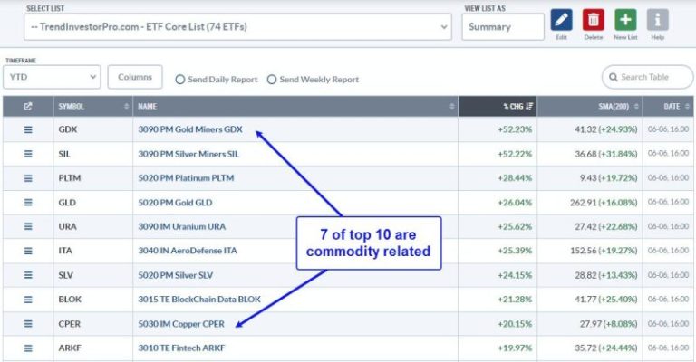
TrendInvestorPro uses a Core ETF ChartList to track performance and rank momentum. This list includes 59 equity ETFs, 4 bond ETFs, 9 commodity ETFs and 2 crypto ETFs. The image below shows the top 10 performers year-to-date (%Chg). Seven of the top ten are metals-related ETFs. Gold Miners (GDX), Silver Miners (SIL), Platinum (PLTM) and Gold (GLD) are leading the way. The Aerospace & Defense ETF (ITA), Transformational Data Sharing ETF (BLOK) and ARK Fintech Innovation ETF (ARKF) are the only three non-commodity leaders. The message here is clear: metals are leading.

********************

Subscribe to TrendInvestorPro and get these four bonuses:

  • Adding and Testing an Exit Strategy for the Zweig Breadth Thrust
  • The Bottoming Sequence: Capitulation, V Reversals, Thrusts and Bull Market
  • 200-day Cross for SPY/QQQ: Improve Performance with Smoothing, Filters and a Twist
  • Core ETF ChartList (59 equity ETFs, 4 bond ETFs, 9 commodity ETFs, 2 crypto ETFs)

Click here to take a trial and gain full access

********************

TrendInvestorPro has been tracking the Platinum ETF (PLTM) and Palladium ETF (PALL) since their big breakout surges on May 20th. The chart below shows PALL with a higher low from August to April and a breakout on May 20th. The ETF fell back below the 200-day SMA (gray line) in late May, but resumed its breakout with a 7.75% surge this week.

The bottom window shows the PPO(5,200,0) moving above +1% on May 21st to signal an uptrend in late May. This signal filter means the 5-day EMA is more than 1% above the 200-day EMA. The uptrend signal remains valid until a cross below -1% (pink line). As with all trend-following signals, there are bad signals (whipsaws) and good signals (extended trends). Given overall strength in metals, this could be a good signal that foreshadows an extended uptrend.

TrendInvestorPro is following this signal, as well as breakouts in other commodity-related ETFs. Our comprehensive reports and videos focus on the leaders. This week we covered flags and pennants in several tech ETFs (XLK, IGV, SMH, ARKF, AIQ, MAGS). Click there to take a trial and get your four bonuses. 

/////////////////////////////////


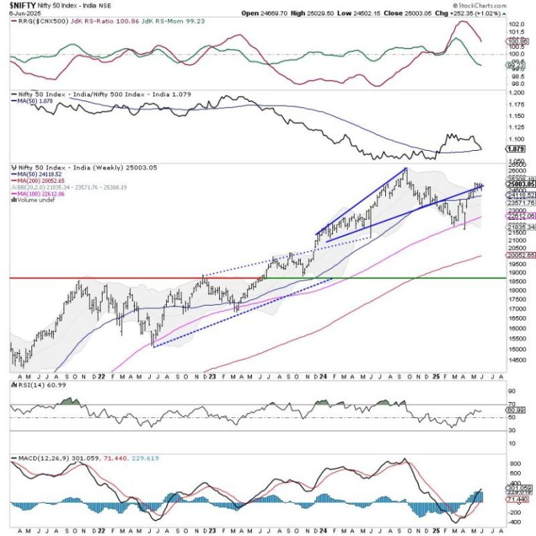
After consolidating for two weeks, the Nifty finally appeared to be flexing its muscles for a potential move higher. Over the past five sessions, the Nifty traded with an underlying positive bias and ended near the week’s high point while also attempting to move past a crucial pattern resistance. The past week saw the Index oscillating in the 527-point range, which was in line with the previous weeks. The volatility also cooled off; the India VIX came off by 9% to 14.63 on a weekly basis. While staying largely in a range trading with a positive bias, the headline Index closed with a net weekly gain of 252.35 points (+1.02%).

Over the past couple of weeks, the Nifty has traded in a well-defined range created between 24500-25100 levels. This would mean that the markets would remain devoid of directional bias unless they take out 25100 on the higher side or violate the 24500 level. Despite visibly strong undercurrents, staying reactive to the markets rather than getting predictive would be prudent. Although there are heightened possibilities of the Nifty taking out the 25100 level, we must consider it as resistance until it is taken out convincingly.

The coming week is set to see a stable start; the levels of 25150 and 25400 are likely to act as resistance points. The supports come in at 24800 and 24500. The trading range is expected to get wider than usual.

The weekly RSI is 60.94; it continues to remain neutral and does not show any divergence against the price. The weekly MACD is bullish and remains above its signal line. A strong white candle emerged; this shows the bullish trend that the markets had during the week.

A pattern analysis of the weekly chart shows that the Nifty resisted the upward rising trendline that began from the low of 21350 and joined the subsequent rising bottoms. The Nifty has attempted to penetrate it after resisting it for a couple of weeks.

Overall, the coming week may see the markets trading with an underlying bullish bias. However, for this to culminate in a good trending move, the Index will have to take out the 25100-25150 zone convincingly on the upside. Until this happens, the markets may continue to consolidate in a broad trading range. Unless there is a strong move that surpasses the 25100-25150 zone, one must consider this level as an immediate resistance point. Some pockets have run up too hard over the past few days; one must also focus on protecting gains at current levels rather than chasing the up moves. Fresh purchases must be kept limited in stocks with strong technical setups and the presence of relative strength. A cautiously positive approach is advised for the coming week.


Sector Analysis for the coming week

In our look at Relative Rotation Graphs®, we compared various sectors against the CNX500 (NIFTY 500 Index), representing over 95% of the free-float market cap of all the listed stocks. 

Relative Rotation Graphs (RRG) show that the Nifty PSU Bank Index continues to build on its relative momentum while staying inside the leading quadrant. It may continue outperforming the markets relatively. The Infrastructure, Consumption, and PSE Index are also inside the leading quadrant but are seen giving up on their relative momentum.

The Nifty Bank Index has rolled inside the weakening quadrant. The Nifty Services Sector, Financial Services, and Commodity Indice are also inside the weakening quadrant. Individual performance of components from these groups may be seen, but overall relative performance may slow down over the coming weeks.

The Nifty FMCG Index has rolled inside the lagging quadrant. The Nifty Metal and Pharma Indice are languishing in this quadrant. The Nifty IT index is also inside the lagging quadrant but is seen in a strong bottoming-out process while improving its relative momentum.

The Nifty Energy, Media, Realty, and Auto Indices are inside the improving quadrant and may continue improving their relative performance against the broader markets.


Important Note: RRG charts show the relative strength and momentum of a group of stocks. In the above Chart, they show relative performance against NIFTY500 Index (Broader Markets) and should not be used directly as buy or sell signals.  


Milan Vaishnav, CMT, MSTA

Consulting Technical Analyst

www.EquityResearch.asia | www.ChartWizard.ae


Stay ahead of the market in under 30 minutes! In this video, Mary Ellen breaks down why the S&P 500 just broke out, which sectors are truly leading (industrials, technology & materials), and what next week’s inflation data could mean for your portfolio.

This video originally premiered June 6, 2025. You can watch it on our dedicated page for Mary Ellen’s videos.

New videos from Mary Ellen premiere weekly on Fridays. You can view all previously recorded episodes at this link.

If you’re looking for stocks to invest in, be sure to check out the MEM Edge Report! This report gives you detailed information on the top sectors, industries and stocks so you can make informed investment decisions.


I’m a huge fan of using platforms like StockCharts to help make my investment process more efficient and more effective.  The StockCharts scan engine helps me identify stocks that are demonstrating constructive technical configuration based on the shape and relationship of multiple moving averages.

Today I’ll share with you one of my favorite scans, called “Moving Averages in Correct Order”, and walk through three charts that highlight the benefits of identifying charts in primary uptrend phases.

Primary Uptrends Can Be Defined By Moving Averages

This scan, which StockCharts members can access in the Sample Scan Library, basically looks for three criteria to be met for any chart:

  1. 20-day EMA > 50-day SMA
  2. 50-day SMA > 100-day SMA
  3. 100-day SMA > 200-day SMA

The general approach here is to find charts where the short-term moving averages are above their longer-term counterparts.  By making multiple comparisons, we can ensure a more consistent uptrend phase based on the recent price action.  

Let’s review two charts that I feel are representative of the stocks that will tend to come up using this scanning approach.

You’ll Probably Find Two Types of Charts in the Results

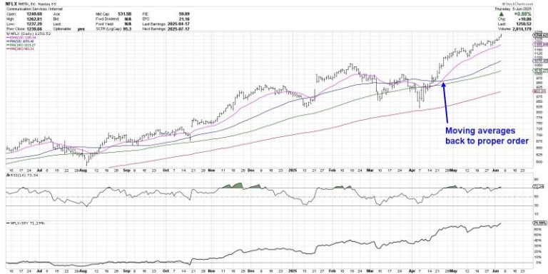
The most common result will be a chart that is in a long-term primary uptrend, making consistently higher highs and higher lows.  Netflix (NFLX) is a great example of this sort of “long and strong” price action.

The four moving averages have remained in the proper order as described above for most of the last 12 months.  After NFLX pulled back to its April low, a bounce back above the March swing high moved the 21-day exponential moving average back above the 50-day simple moving average.  From that breakout point, the stock has continued to push to new all-time highs into early June.

One thing I love about this scan is it helps me confirm which stocks are in persistent uptrends, because those are the types of charts that I generally want to be following as they trend higher.  But sometimes, a pullback chart will come up in the scan as well.  Here’s TJX, which has recently pulled back after achieving a new all-time high in May.

We can see that the moving averages returned to the proper order in early April after rotating higher off a major low in mid-March.  From that point, TJX had a false breakout in mid-April before finally completing the move to a new high in early May.  TJX subsequently gapped lower after an earnings miss, and the stock has now pulled back to an ascending 50-day moving average.

The TJX chart reminds me of three benefits of following moving averages over time.  First, we can look at the slope of an individual moving average to evaluate the shape of the trend on a specific time frame.  Second, we can compare multiple moving averages to validate the trend on multiple time frames.  Finally, we can use moving averages as potential support and resistance levels in the event of a pullback.

With TJX testing an ascending 50-day moving average this week, I’m inclined to treat this chart as “innocent until proven guilty” as long as it remains above this key trend barometer.  But if and when the 50-day moving average is violated, and if the moving averages are no longer in the proper order, then I would need to reevaluate a long position.

Why the Transition to Proper Order is So Important

This final example shows how the transition between moving average configurations can prove so valuable in understanding trend transitions.  Here’s a daily chart of VeriSign (VRSN) showing how the relationship between the moving averages can help us better label the different trend phases.

On the left third of the chart, we can see the moving averages mostly in a bearish order, confirming a distribution phase for the stock.  Then in June 2024, the moving averages change to where there’s no real clean definition of the trend.  This represents a consolidation phase, where buyers and sellers are essentially in agreement.

Finally, we can see that when the moving averages finally achieve a bullish configuration, VRSN is now in an accumulation phase of higher highs and higher lows.  And as long as those moving averages remain in the proper order, the uptrend phase is confirmed.

The goal with this moving average scan is to help us identify charts that are just rotating into the accumulation phase.  It’s also designed to encourage us to stick with winning trends as long as the price action confirms the uptrend.  And if and when the moving average configuration changes, then our approach should probably change as well!

RR#6,

Dave

PS- Ready to upgrade your investment process?  Check out my free behavioral investing course!

David Keller, CMT

President and Chief Strategist

Sierra Alpha Research LLC

marketmisbehavior.com

https://www.youtube.com/c/MarketMisbehavior

Disclaimer: This blog is for educational purposes only and should not be construed as financial advice.  The ideas and strategies should never be used without first assessing your own personal and financial situation, or without consulting a financial professional.  

The author does not have a position in mentioned securities at the time of publication.    Any opinions expressed herein are solely those of the author and do not in any way represent the views or opinions of any other person or entity.


Recently, the S&P 500 ($SPX) has been racking up a good number of wins.

Since late April, the index has logged its third winning streak of at least five: a nine-day streak from April 22–May 2 and a six-day streak from May 12–May 19. That makes for a cluster of long winning streaks, which is something that also showed up in late 2023 and mid-2024.

To put it simply, these bunches of buying usually show up in uptrends. Note how there were no five-day winning streaks during the three corrections pictured on the chart below (in August–October 2023, July–August 2024, and February–April 2025). Most of the clusters happened as the S&P 500 was in the middle of a consistent upswing; the only time we saw a long winning streak occur right before a big downturn was in late July 2024. That came after a strong three-month run from the April lows, with the S&P 500 gaining 14% in three months.

CHART 1. WINNING STREAKS IN THE S&P 500. Since late April, the S&P 500 has logged a nine-day streak from April 22 to May 2 and a six-day streak from May 12 to May 19.

Currently, the SPX is up 23% in just under two months. It wouldn’t be surprising to see a break in the action at some point soon.

The key difference between now and July is that back in July, the S&P 500 was making new highs for two straight months. That’s not the case now, as the index is still below the February 2025 highs. So it’s not apples to apples, but, at some point, the market will have to deal with more than a minor pullback once again.

Sentiment Check

After the close on Wednesday, I ran an X poll asking if the 0.01% move was bullish or bearish. The result: 61% said bullish.

This tells us that most people saw Wednesday’s pause as a sign that the bears are unable to push the market higher, which could be true. But it also suggests complacency. The onus still is squarely on the bears to do something with this, with the only true sign of weakness in the last six weeks coming on May 21, when the S&P 500 plummeted 1.6%. That ended up being an aberration… for now.

UBER Stock: One to Watch

Sometimes, a specific stock can provide clues about the broader market’s next step. Right now, we think that the stock is UBER.

Technically speaking, UBER is at a critical spot, and it’s also an important stock given that it was one of the first growth names to break out to new all-time highs. The stock remains in a long-term uptrend, which, of course, is bullish, but it has quietly pulled back 13% from its May 20 high of $93 and was just down nine out of 10 trading sessions (see the weekly chart of UBER stock). We can see that the stock has fully retraced the price action from the pattern breakout near $82.

CHART 2. WEEKLY CHART OF UBER STOCK. The stock is in a long-term uptrend, although it has retraced. Here’s where things get really interesting. UBER has now formed a potential bearish head-and-shoulders pattern, seen on the daily chart. If the stock breaks below $82, it will target the 71-zone.

CHART 3. DAILY CHART OF UBER STOCK. Will UBER’s stock price hold support or break below it? This chart is one to monitor.

So, here are three outcomes to watch for. UBER’s stock price could:

  1. Hold support (bullish).
  2. Break below $82, but then reverse higher, which would be a bear trap (bullish).
  3. Break below $82 and continue lower and hit the downside target (bearish).

If #3 occurs, the odds are UBER won’t be declining by itself; it’ll likely drag the broader market down with it. This shows the significance of UBER stock, which certainly makes it one to keep an eye on.


A lot has happened in the stock market since Liberation Day, keeping us on our toes. Volatility has declined significantly, stocks have bounced back from their April 7 low, and the economy has remained resilient.

If you’re still feeling uncertain, though, you’re not alone. The stock market’s in a bit of a “wait and see” mode, going through a period of consolidation as it figures out its next move. 

The S&P 500 ($SPX) is hesitating to hit 6000 despite reclaiming its 200-day simple moving average (SMA). This indecision can leave investors feeling stuck in “no man’s land.” And it’s not just the S&P 500, either; most major indexes are in a similar scenario, except for small caps, which have been left behind. This could be because the market has priced in a delay in interest rate cut expectations.

Tech Is Taking the Lead

If you drill down into the major indexes, there is some action you shouldn’t ignore. Tech stocks have started to take the lead again, although momentum has been lacking. Over the past month, the Technology sector has been up over 4%.

FIGURE 1. S&P SECTOR ETF PERFORMANCE OVER THE LAST 30 DAYS. Technology is the clear leader with a gain of over 4%.Image source: StockCharts.com. For educational purposes. It’s encouraging to see tech stocks regain their leadership position. Tech is a major force behind the S&P 500 and Nasdaq Composite ($COMPQ). The daily chart of the Technology Select Sector SPDR Fund (XLK) shows the ETF has been trying to break above a consolidation range it has been stuck in since mid-May.

FIGURE 2. DAILY CHART OF XLK. Although the ETF has barely broken above its consolidation range, we need to see greater momentum to confirm a follow through to the upside.Chart source: StockCharts.com. For educational purposes.Nothing is standing in the way of XLK reaching its all-time high, but the momentum isn’t quite there yet. The 14-period relative strength index (RSI) is below 70 and looks to be stalling, pretty much in line with the overall stock market’s price action.

So, what’s the market waiting for? Maybe a catalyst, like Friday’s non-farm payrolls report. This week’s JOLTS, ADP, and ISM Services data didn’t move the needle much, but the NFP report could be the game changer.

S&P 500 Technical Forecast

Where could the S&P 500 go from here? Let’s dive into the weekly chart.

FIGURE 3. WEEKLY CHART OF THE S&P 500. The index is spitting distance to its all-time high. A break above the November high would clear the path to new highs.Chart source: StockCharts.com. For educational purposes.

The S&P 500 broke above its 40-week SMA on the week of May 12 and has held above it. However, it has been in a consolidation for the last month, similar to that of XLK.

The S&P 500 is approaching its November high of 6017. A break above it could push it toward new highs. On the flip side, if it slides below the 40-week SMA, it would be a cause for concern and could mean the May 12 gap-up could get filled. Keep an eye on the 5688 level. If the S&P 500 pulls back close to that level and turns around, it would be a healthy correction — an opportunity to buy the dip. A further downside move would mean exercising patience or unloading some of your positions.

What’s Going On With Gold and Bonds?

While stocks are grinding sideways, gold prices are rising, and bond prices are showing green shoots. This price action tells us that investors could be bracing for slower growth ahead. It’s not something to panic about — just something to watch.

You can get a quick look at what gold, bonds, and all the major indexes are doing by checking out the StockCharts Market Summary page and Your Dashboard.

So, what should you do?

Hold, add, or fold? That’s the big question. The market needs time to digest a lot, from economic data to geopolitical risks and policy headlines. Keep checking in and monitor the sectors, observe index performance, and note how other areas of the market, such as precious metals and bonds, are reacting.


 Disclaimer: This blog is for educational purposes only and should not be construed as financial advice. The ideas and strategies should never be used without first assessing your own personal and financial situation, or without consulting a financial professional.